TextSwitcher
Introduction
Button-style text selection is an effective way to improve user experience in WooCommerce stores. When customers can click on styled text buttons instead of traditional radio buttons or dropdowns, they make selections faster and with more confidence. WooCommerce text swatches transform standard form elements into modern, button-based selection interfaces that are more engaging and intuitive.
Instead of using small radio buttons or cluttered dropdown menus, WooCommerce text swatches display options as visually appealing buttons that customers click to select. This modern interface improves usability, reduces decision time, and creates a more professional appearance that builds trust with customers.
In this comprehensive guide, we will explain what WooCommerce text swatches are, explore why they’re essential for your store, show you how to implement text switcher fields step-by-step, and provide best practices for creating effective button-based text selection experiences.
What Is WooCommerce Text Switcher?
WooCommerce text switcher (also called text swatches) is a field type that displays product options as clickable text buttons instead of standard radio buttons or dropdowns. Each option appears as a styled button that customers click to make their selection, creating a modern, button-based interface that’s more engaging than traditional form elements.
Key Characteristics:
- Button-Style Display: Options displayed as styled buttons with hover effects
- Single Selection: Radio button behavior—customers select one option
- Visual Feedback: Selected button shows dark background (#353c4e) with white text
- Responsive Width: Buttons adjust from 120px to 200px based on text length
- Mobile-Optimized: Buttons expand to full width on mobile devices
- Per-Option Pricing: Each text option can have its own price adjustment
- Clean Layout: Inline-flex layout for organized button display
WooCommerce text switcher transforms static form elements into dynamic, button-based interfaces that help customers make selections quickly and confidently.
Why Your Store Needs Text Swatches
- Modern, Professional Appearance
- Button-style text selection creates a modern, professional appearance that builds trust with customers. Stores using WooCommerce text swatches appear more polished and customer-focused than those relying solely on standard radio buttons or dropdowns.
- WooCommerce text swatches provide a contemporary interface that matches the look and feel of high-end e-commerce sites, improving your store’s credibility and professionalism.
- Faster Selection Process
- Button-based selection is faster than traditional form elements. Customers can quickly scan text buttons and click their choice without reading through dropdown menus or selecting small radio buttons.
- WooCommerce text swatches make option selection nearly instantaneous, reducing the time customers spend on product pages and improving overall shopping experience.
- Better Mobile Experience
- On mobile devices, clicking large text buttons is much easier and more intuitive than selecting small radio buttons or navigating dropdown menus. WooCommerce text swatches provide a touch-friendly interface optimized for mobile shopping.
- WooCommerce text swatches create a better mobile shopping experience that encourages purchases on smartphones and tablets.
- Better Mobile Experience
- On mobile devices, tapping a color swatch is much easier and more intuitive than navigating dropdown menus or selecting small radio buttons. WooCommerce color swatches provide a touch-friendly interface optimized for mobile shopping.
- WooCommerce color swatches create a better mobile shopping experience that encourages purchases on smartphones and tablets.
- Clear Visual Feedback
- When customers select a text option, the button clearly changes to a dark background with white text, providing immediate visual confirmation of their choice. This reduces uncertainty and helps customers understand their selection.
- WooCommerce text swatches provide clear visual feedback that eliminates confusion and builds customer confidence.
- Improved Accessibility
- Large, clearly labeled buttons are easier to interact with than small radio buttons, especially for users with motor disabilities or those using touch devices. WooCommerce text swatches improve accessibility compared to traditional form elements.
- Increased Conversion Rates
- Button-style selection makes the customization process more engaging and less intimidating. Customers are more likely to complete purchases when they can easily see and select their options with clear, clickable buttons.
- WooCommerce text swatches can increase conversion rates by making option selection easier and more appealing.
Use Cases for Text Swatches
- Material Selection
- WooCommerce text swatches are ideal for material selection options:
- Fabric Materials: Cotton, Polyester, Silk, Linen, Wool
- Leather Types: Genuine Leather, Faux Leather, Canvas, Suede
- Construction Materials: Wood, Metal, Plastic, Glass, Ceramic
- Printing Materials: Matte Paper, Glossy Paper, Cardstock, Vinyl
- Example: Furniture stores use text swatches for upholstery materials: Cotton ($0), Polyester (+$50), Leather (+$200), Silk (+$300).
- WooCommerce text swatches are ideal for material selection options:
- Size Options
- Text swatches work well for size selections:
- Clothing Sizes: Small, Medium, Large, XL, XXL
- Bedding Sizes: Twin, Full, Queen, King, California King
- Container Sizes: 6oz, 12oz, 16oz, 20oz, 32oz
- Portion Sizes: Small, Regular, Large, Extra Large
- Example: T-shirt stores display size options as buttons: S ($0), M ($0), L ($0), XL (+$2), XXL (+$4).
- Text swatches work well for size selections:
- Service Tiers
- Text swatches are perfect for service tier selection:
- Service Levels: Basic, Standard, Premium, Enterprise
- Membership Tiers: Bronze, Silver, Gold, Platinum
- Support Levels: Starter, Professional, Business
- Quality Grades: Economy, Standard, Premium, Deluxe
- Example: Web design services offer tiers as buttons: Basic ($99), Standard ($199), Premium ($399), Enterprise ($999).
- Text swatches are perfect for service tier selection:
- Time/Duration Options
- Text swatches work well for time-based selections:
- Service Duration: 1 Hour, 2 Hours, Half Day, Full Day
- Subscription Intervals: Weekly, Bi-weekly, Monthly, Quarterly, Annually
- Shipping Speed: Express (1-2 Days), Standard (3-5 Days), Economy (5-7 Days)
- Delivery Time: Same Day, Next Day, 2-3 Days, Standard
- Example: Cleaning services display duration as buttons: 1 Hour ($50), 2 Hours ($90), Half Day ($150), Full Day ($250).
- Text swatches work well for time-based selections:
- Style Preferences
- Text swatches are ideal for style and preference selections:
- Design Styles: Modern, Classic, Vintage, Rustic, Contemporary
- Aesthetic Preferences: Minimalist, Bold, Elegant, Casual, Formal
- Interior Styles: Industrial, Farmhouse, Scandinavian, Bohemian
- Fashion Styles: Casual, Business, Formal, Sporty, Trendy
- Example: Custom furniture stores offer style options: Modern ($0), Classic (+$50), Vintage (+$75), Rustic (+$50).
- Text swatches are ideal for style and preference selections:
- Finish Types
- Text swatches work well for finish and coating selections:
- Surface Finishes: Matte, Gloss, Satin, Semi-Gloss
- Metal Finishes: Polished, Brushed, Textured, Anodized
- Wood Finishes: Natural, Stained, Painted, Varnished
- Fabric Finishes: Smooth, Textured, Embossed, Patterned
- Example: Custom cabinets offer finish options: Matte ($0), Gloss (+$30), Satin (+$20), Textured (+$40).
- Text swatches work well for finish and coating selections:
- Subscription Intervals
- Text swatches are perfect for subscription interval selection:
- Billing Cycles: Weekly, Bi-weekly, Monthly, Quarterly, Annually
- Delivery Frequency: Weekly, Bi-weekly, Monthly
- Renewal Periods: 1 Month, 3 Months, 6 Months, 12 Months
- Payment Plans: Monthly, Quarterly, Semi-Annual, Annual
- Example: Subscription boxes display intervals as buttons: Monthly ($29), Quarterly ($79), Annually ($299).
- Text swatches are perfect for subscription interval selection:
- Quality Grades
- Text swatches work well for quality tier selections:
- Product Grades: Grade A, Grade B, Grade C
- Quality Levels: Premium, Standard, Economy
- Certifications: Organic, Conventional, Certified Organic
- Standards: Luxury, Standard, Budget
- Example: Produce stores offer grades: Organic (+$3), Grade A ($0), Grade B (-$2), Conventional (-$4).
- Text swatches work well for quality tier selections:
Text Switcher Features Overview (Free vs Premium)
| Feature | Free | Premium |
|---|---|---|
| Basic Text Switcher | ❌ | ✅ |
| Button-Style Display | ❌ | ✅ |
| Visual Active State | ❌ | ✅ |
| Per-Option Pricing | ❌ | ✅ |
| Option Labels | ❌ | ✅ |
| Drag-and-Drop Ordering | ❌ | ✅ |
| Responsive Button Layout | ❌ | ✅ |
| Conditional Logic Integration | ❌ | ✅ |
Premium Version Features
The premium version of WooCommerce text switcher includes all button-style text selection features:
- Button-Style Options: Text options displayed as styled buttons
- Single Selection: Radio button behavior—one option selection per field
- Visual Active State: Selected button shows dark background (#353c4e) with white text
- Responsive Width: Buttons adjust from 120px to 200px based on text length
- Mobile Optimization: Buttons expand to full width on mobile devices
- Per-Option Pricing: Each option can have fixed or percentage-based price adjustments
- Option Labels: Descriptive names for each option (e.g., “Cotton”, “Silk”, “Linen”)
- Drag-and-Drop Ordering: Easy reordering of options in admin
- Clean Layout: Inline-flex layout for organized button display
- Conditional Logic: Show/hide text options based on other selections or conditions
How to Add Text Switcher Fields (Step-by-Step)
Note: Color Switcher is a Premium-only feature of Extra Product Options for WooCommerce.
- Step 1: Create an Options Group
- Go to WooCommerce → Product Addons in your WordPress admin dashboard
- Click Add New to create a new options group
- Give it a descriptive name like “Material Options” or “Size Selection”
- Configure general settings for the options group if needed
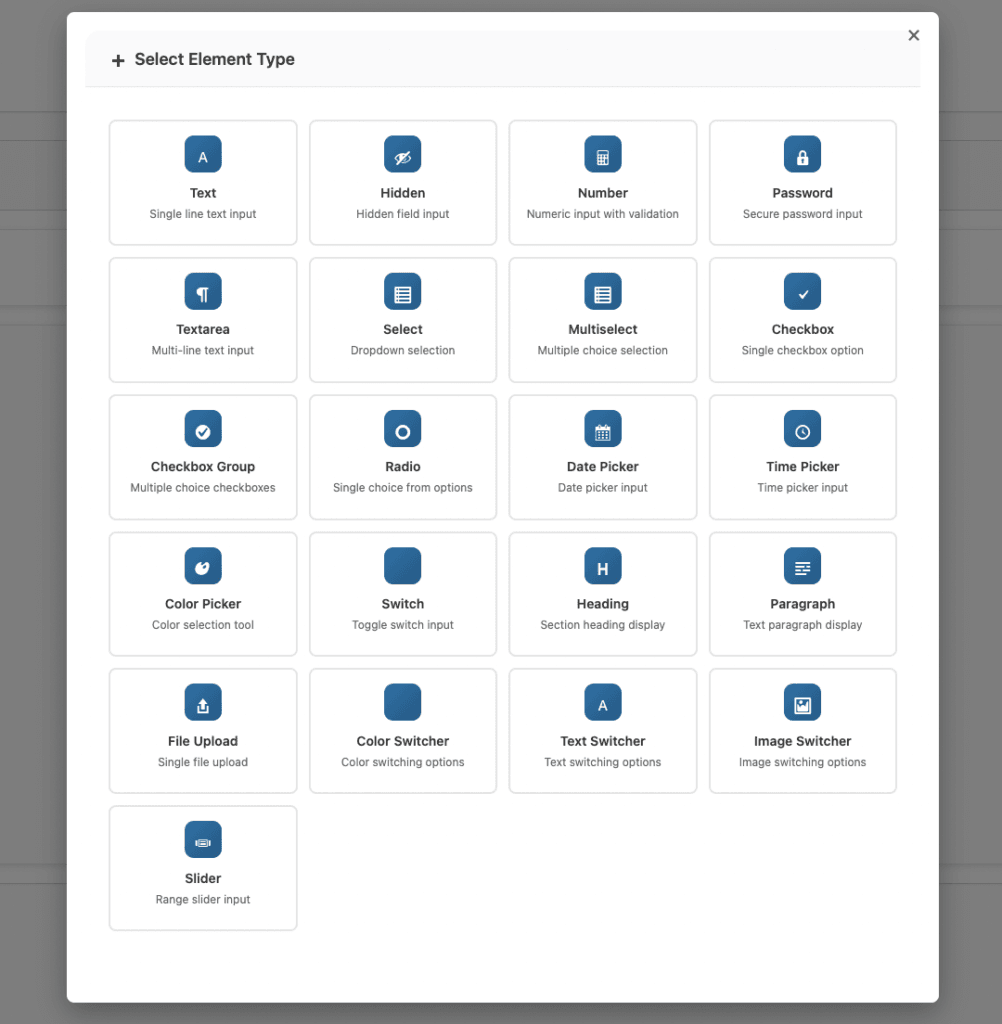
- Step 2: Add a Text Switcher Field
- Click Add Element or the + button to add a new field
- Select Text Switcher from the available field types
- The text switcher field will appear in your field list
- Configure basic field settings:
- Field Status: Enable the field
- Field Label: Enter a customer-facing label (e.g., “Select Material”)
- Field Subtitle: Add optional subtitle for context (e.g., “Choose your preferred fabric type”)
- Field Name: Set a unique identifier (auto-generated from label)
- Required: Set as required if selection is mandatory
- Step 3: Add Text Options
- For each text option, configure the following settings:
- Click Add Option to create a new text option
- Option Label: Enter the text that appears on the button
- Keep labels short (1-3 words ideal)
- Use clear, descriptive names
- Examples: “Cotton”, “Silk”, “Large”, “Premium”
- Price Type: Choose how price adjustment is calculated
- Fixed: Adds a specific amount (e.g., +$5.00)
- Percentage: Adds percentage of base price (e.g., +10%)
- Leave empty if no price adjustment needed
- Price: Enter the price adjustment amount (if applicable)
- For each text option, configure the following settings:
- Step 4: Add Multiple Options
- Click Add Option for each additional option you want to offer
- Enter clear, concise labels for each option
- Set pricing for each option if applicable
- Drag options using the move handle to reorder them logically
- Tips for Adding Options:
- Keep text short for best button appearance
- Use consistent naming conventions
- Limit to 3-8 options for optimal UX
- Order options logically (size: small to large, price: low to high)
- Step 5: Configure Display Rules (Optional)
- Set up Additional Rules to control where text options appear:
- Product Conditions: Show options on specific products only
- Category Conditions: Display options for products in certain categories
- Tag Conditions: Show options for products with specific tags
- User Role Conditions: Display different options for different customer segments
- Use conditional logic to show relevant options based on other selections
- Set up Additional Rules to control where text options appear:
- Step 6: Save and Test
- Click Save Addon to save your text switcher configuration
- Visit your product page to see the text button swatches
- Test option selection by clicking different buttons
- Verify the selected option appears correctly with active state
- Check that pricing adjustments work if configured
- Test on mobile devices to ensure full-width button display
Text Switcher Settings Explained
- Option Labels
- Option Labels
- Give each color a clear, descriptive name that helps customers understand what they’re choosing:
- Label Best Practices:
- Short Text (1-3 words): Ideal for button display
- Good: “Cotton”, “Large”, “Premium”
- Avoid: “Premium Quality Cotton Fabric Material”
- Clear and Descriptive: Help customers understand the option
- Good: “Genuine Leather”, “Express Shipping”
- Avoid: “Option A”, “Choice 1”, abbreviations customers won’t understand
- Consistent Style: Keep naming parallel in structure
- Good: “Small, Medium, Large” (all sizes)
- Avoid: “Small, Med, Extra Large” (inconsistent)
- Short Text (1-3 words): Ideal for button display
- Label Length Considerations:
- Buttons have a minimum width of 120px and maximum of 200px
- Long text may wrap or be cut off
- Keep labels concise for best appearance
- Consider abbreviations for very long terms if necessary
- Pricing per Option
- Each text option can have its own price adjustment:
- Price Type Options:
- No Price: Option included in base price (leave price empty)
- Fixed Amount: Adds a specific dollar amount (e.g., +$5.00)
- Use when the cost difference is constant regardless of product price
- Example: Premium material adds $5 to any product
- Percentage: Adds a percentage of the base product price (e.g., +10%)
- Use when the cost scales with product price
- Example: 10% upcharge on premium options for expensive items
- Pricing Display
- Price adjustments are shown with each option
- Selected option’s price is included in cart total
- Price differences help customers understand costs
- Example Pricing Setup
- Material Selection: Cotton ($0), Polyester (+$2), Silk (+$15), Linen (+$8)
- Size Selection: S ($0), M ($0), L ($0), XL (+$2), XXL (+$4)
Best Practices for Text Swatches
- Keep Text Short
- Button text should be scannable at a glance:
- Use Cotton Instead of Premium Quality Cotton Fabric
- Use XL instead of Extra Large Size Option
- Use Professional instead of Professional Service Package
- Use Leather instead of Genuine Italian Leather Material
- Why Short Text Matters:
- Buttons have limited width (120-200px)
- Long text wraps awkwardly or gets cut off
- Short text is easier to scan and understand
- Better mobile experience with shorter labels
- Button text should be scannable at a glance:
- Use Consistent Naming
- Keep option names parallel in structure and style:
- Good Examples:
- Sizes: Small, Medium, Large (all sizes, consistent format)
- Materials: Cotton, Silk, Linen (all materials, same category)
- Quality: Basic, Standard, Premium (all quality levels, parallel structure)
- Inconsistent Examples:
- Bad: Small, Med, Extra Large (mixed abbreviations)
- Bad: Cotton, Silk Fabric, Linen Material (inconsistent descriptions)
- Bad: Basic, Standard Option, Premium Quality (inconsistent structure)
- Benefits of Consistent Naming:
- Easier for customers to compare options
- More professional appearance
- Reduces confusion
- Better user experience
- Limit Options to 3-8
- Too many options can overwhelm customers:
- Optimal Range:
- 3-5 Options: Ideal for quick decisions
- 6-8 Options: Maximum for good UX
- 10+ Options: Consider using a dropdown instead
- Why Limit Options:
- Reduces decision paralysis
- Faster selection process
- Better mobile experience (fewer buttons to scroll)
- Cleaner, more professional appearance
- When to Use Dropdown Instead:
- More than 8 options
- Options have long descriptions
- Space is limited on the page
- Options change frequently
- Optimal Range:
- Too many options can overwhelm customers:
- Order Options Logically
- Arrange options in a way that makes sense to customers:
- Ordering Strategies:
- Size Order: Small → Medium → Large → XL → XXL
- Quality Order: Basic → Standard → Premium → Deluxe
- Price Order: Low → High (if options have different prices)
- Alphabetical: For similar items without natural order (e.g., colors: Black, Blue, Green, Red)
- Popularity: Best-selling options first
- Benefits of Logical Ordering:
- Easier for customers to find desired option
- More professional appearance
- Faster selection process
- Better user experience
- Ordering Strategies:
- Arrange options in a way that makes sense to customers:
- Show Price Differences Clearly
- If options have different prices, display them clearly:
- Price Display Best Practices:
- Show price with each option button
- Use consistent format (+$5, +$10, etc.)
- Display base price clearly (e.g., “Cotton ($0)”)
- Be transparent about upcharges
- Example Clear Pricing:
- Cotton ($0)
- Polyester (+$2)
- Silk (+$15)
- Linen (+$8)
- Why Transparent Pricing Matters:
- Builds trust with customers
- Reduces cart abandonment from unexpected costs
- Sets proper expectations
- Improves customer satisfaction
- Price Display Best Practices:
- If options have different prices, display them clearly:
- Use Descriptive Field Labels
- Help customers understand what they’re choosing:
- Good Field Label Examples:
- “Select Material” (clear action and purpose)
- “Choose Size” (clear action)
- “Pick Your Style” (friendly, clear)
- “Select Shipping Speed” (specific and clear)
- Avoid These:
- “Option 1” (not descriptive)
- “Size” (missing action word)
- “Selection” (too vague)
- Add Subtitles for Context:
- Field Label: “Select Material”
- Subtitle: “Choose your preferred fabric type”
- Provides additional context when needed
- Good Field Label Examples:
- Help customers understand what they’re choosing:
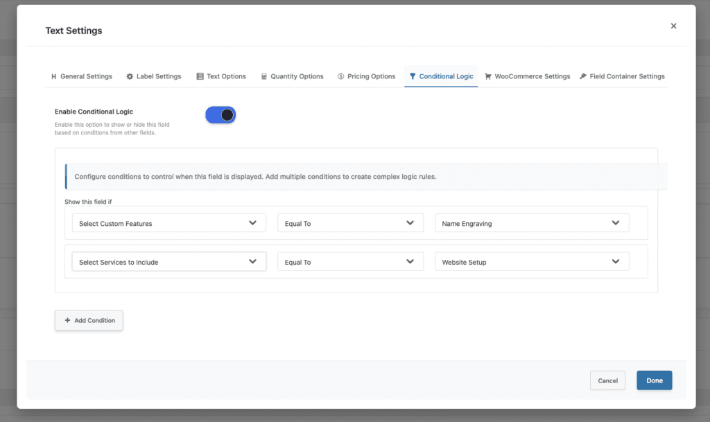
- Combine with Conditional Logic
- Show relevant options based on other product selections:
- Conditional Logic Benefits:
- Show material options only for customizable products
- Display size options based on product category
- Hide unavailable options automatically
- Show different options for different product types
- Conditional Logic Benefits:
- Show relevant options based on other product selections:
WooCommerce text swatches work even better when combined with display rules and conditional logic to show only relevant options.
Common Mistakes to Avoid
- Mistake 1: Using Too Long Text
- Problem: Option labels are too long for button display.
- Impact: Text wraps awkwardly, gets cut off, or buttons become too wide, creating a poor user experience.
- Solution:
- Keep labels to 1-3 words maximum
- Use abbreviations for long terms when necessary
- Test button display with actual text
- Consider using subtitles for additional context
- Mistake 2: Inconsistent Naming
- Problem: Option names use mixed formats, abbreviations, or styles.
- Impact: Confusing for customers, appears unprofessional, makes options harder to compare.
- Solution:
- Use consistent naming convention across all options
- Avoid mixing abbreviations with full words
- Keep structure parallel (all sizes, all materials, etc.)
- Test readability before publishing
- Mistake 3: Too Many Options
- Problem: Offering 10+ text options overwhelms customers.
- Impact: Decision paralysis, slower selection process, increased cart abandonment, cluttered interface.
- Solution:
- Limit to 3-8 options maximum
- Consider using dropdown for 10+ options
- Group similar options if necessary
- Prioritize popular options
- Mistake 4: Poor Option Ordering
- Problem: Options arranged randomly or illogically.
- Impact: Difficult for customers to find desired option, appears unprofessional, slower selection process.
- Solution:
- Order logically (size: small to large, price: low to high)
- Put popular options first
- Use consistent ordering across similar fields
- Test with customers if possible
- Mistake 5: Hidden Price Differences
- Problem: Not clearly displaying when options cost more.
- Impact: Customer surprise at checkout, cart abandonment, negative reviews, reduced trust.
- Solution:
- Always display price differences clearly
- Show prices with each option button
- Use consistent format (e.g., +$5, +$10)
- Be transparent about all pricing
- Mistake 6: Poor Mobile Experience
- Problem: Not testing text swatches on mobile devices.
- Impact: Poor mobile experience, difficult option selection, lost mobile sales, negative user experience.
- Solution:
- Test text button selection on mobile devices
- Verify buttons expand to full width on mobile
- Ensure touch-friendly button sizes
- Test with actual mobile devices, not just desktop emulation
Troubleshooting Text Switcher Issues
- Issue 1: Buttons Don’t Display Correctly
- Symptoms: Text buttons don’t appear or display incorrectly on product pages.
- Possible Causes:
- CSS conflicts hiding buttons
- Theme compatibility issues
- Plugin conflicts
- Missing CSS styles
- Solutions:
- Check for CSS conflicts in theme or other plugins
- Test with default WooCommerce theme to isolate theme issues
- Clear browser and WordPress cache
- Verify plugin is up to date
- Check browser console for CSS errors
- Disable other plugins temporarily to check for conflicts
- Issue 2: Selected State Not Visible
- Symptoms: Can’t tell which option is selected (no dark background highlight).
- Possible Causes:
- CSS conflicts overriding active state styles
- Theme styles conflicting
- Missing CSS for active state
- JavaScript not working
- Solutions:
- Check for CSS conflicts in theme
- Inspect element to see if active class is applied
- Verify JavaScript is loading correctly
- Add custom CSS if needed to ensure selected state is visible
- Test with default theme to verify functionality
- Issue 3: Buttons Not Working on Mobile
- Symptoms: Text buttons don’t respond to touch or display incorrectly on mobile.
- Possible Causes:
- JavaScript issues on mobile
- Touch event handlers not working
- CSS preventing interaction
- Mobile-specific display issues
- Solutions:
- Test on actual mobile devices (not just emulation)
- Check for JavaScript errors on mobile
- Verify touch events are working
- Ensure buttons expand to full width on mobile as intended
- Test with different mobile browsers
- Issue 4: Price Not Updating When Option Selected
- Symptoms: Price doesn’t change when selecting different text options.
- Possible Causes:
- JavaScript not calculating price correctly
- Price fields not configured properly
- Plugin conflicts preventing price updates
- Cart calculation issues
- Solutions:
- Verify price is set correctly in admin for each option
- Check browser console for JavaScript errors
- Test price calculation in isolation
- Ensure no other plugins are interfering with price calculation
- Clear all caches and test again
- Issue 5: Buttons Cut Off or Wrapped Awkwardly
- Symptoms: Text button labels are cut off or wrap to multiple lines awkwardly.
- Possible Causes:
- Text labels too long for button width
- CSS width constraints too restrictive
- Responsive layout issues
- Container width limitations
- Solutions:
- Shorten option labels to fit button width
- Adjust CSS for button minimum/maximum width if needed
- Test button display with actual text length
- Consider responsive breakpoints for button sizing
- Verify container has adequate width for buttons
Conclusion
WooCommerce text swatches are a powerful feature that transforms standard form elements into modern, button-based selection interfaces. By displaying options as styled text buttons instead of radio buttons or dropdowns, you can improve user experience, reduce decision time, and create a more professional appearance.
Whether you’re selling products with material options, size selections, service tiers, or any short text-based choices, WooCommerce text swatches provide the button-style interface customers need to make selections quickly and confidently.
Remember to keep text short, use consistent naming, limit options appropriately, order them logically, and be transparent about pricing. With proper configuration and best practices, WooCommerce text swatches can significantly enhance your store’s functionality and customer experience.
Related Resources
Frequently Asked Questions
Find answers to commonly asked questions about our products and services.
Still have a question?
If you have any other queries, feel free to reach out to us. Our knowledgeable team is here to help!