

Image Switcher
Create visually engaging selection fields for your WooCommerce products with WPActPro’s Image Switcher Field option. Allow customers to choose options by clicking on image thumbnails for colors, patterns, styles, or any visual choice directly on your product pages.
What is the Image Switcher Field?
The Image Switcher Field allows customers to select options by clicking on visual image thumbnails instead of text-based choices. Each option displays as a clickable image with a label and price, making it perfect for visual selections like colors, patterns, styles, or any scenario where seeing the option is more important than reading about it. The field can be configured for single selection (like radio buttons) or multiple selections (like checkboxes).
Unlike standard WooCommerce product fields, Extra Product Options for WooCommerce’s Image Switcher Field includes advanced features that give you complete control over visual selection and pricing:
How To Use
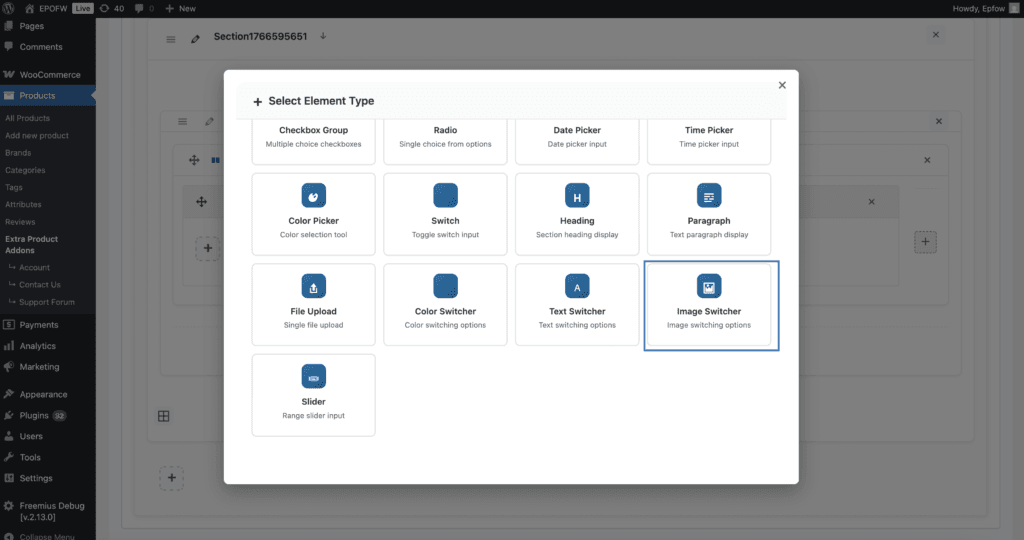
- Navigate to the Products – Extra Product Addons – Product Option – Addon Builder
- Add Section or Element
- Select “Image Switcher” from the Element Popup
- Configure your settings including image options, labels, and pricing in Imageswitcher Options Tab
- Set pricing rules if the selection affects the product price
- Click On Done in the popup and click on Save
Why Use a Image Switcher Field?
Image Switcher fields serve multiple purposes in e-commerce, making them essential for various business models:
- Visual Representation: Customers see exactly what they’re selecting, reducing confusion and returns
- Better UX: Clicking images is more engaging than traditional form fields
- Intuitive Selection: Visual selection is faster and more natural than reading text options
- Professional Appearance: Creates a modern, premium shopping experience
- Flexible Selection: Supports both single and multiple selections based on your needs
- Perfect for Visual Products: Ideal for colors, patterns, fabrics, styles, materials, designs
- Mobile-Friendly: Works excellently on all devices with touch-optimized controls
Common Use Cases:
Furniture Fabric Selection: Perfect for furniture stores where customers need to choose fabric patterns. Each fabric swatch is displayed as an image, making it easy for customers to see the texture, pattern, and color before selecting. The visual representation helps customers make confident decisions.
Jewelry Style Selection: Ideal for jewelry stores showing ring styles, pendant designs, or bracelet variations. Customers can see the actual design before selecting, which is crucial for jewelry purchases where visual appeal matters most.
Wallpaper Pattern Selection: Excellent for home decor stores offering wallpaper with visual pattern previews. Customers can see how different patterns look before making a selection, reducing the need for physical samples.
Design Add-Ons: Perfect for custom printing services where customers can add design elements like logos, patterns, or artwork. Multiple selections allow customers to combine different design elements.
Material Selection: Ideal for products where material appearance matters, such as wood grains, fabric textures, or finish options. Visual representation helps customers understand the material quality and appearance.
Product Variations: Great for products with visual variations like colors, patterns, or styles where seeing the option is more important than reading a description.
WPActPro makes it simple to create advanced visual selection options that directly influence pricing, customization, and the final order.
- For numeric input such as quantities or measurements, try our Number Field
- When you want customers to choose a single option, use our Select Field
- For situations where multiple selections are needed, the Multiselect Field is the best choice.
- To offer simple yes/no or on/off choices, use our Checkbox Field
- And when paragraph-style input is required, try our Textarea Field
Single vs Multiple Selection
Image Switcher has a unique “Allow Multiple” setting that changes its behavior:
| Setting | Behavior | Input Type | Best For |
|---|---|---|---|
| Allow Multiple = OFF | Single selection only | Radio button | Color swatches, style variations, mutually exclusive choices |
| Allow Multiple = ON | Multiple selections allowed | Checkbox | Patterns, add-ons, extras that can be combined |
When to Use Image Switcher vs Other Fields
| Use Image Switcher When | Use Radio/Checkbox When | Use Color Switcher When |
|---|---|---|
| Visual representation needed | Text-only options sufficient | Simple color swatches only |
| Patterns, fabrics, styles | Size, quantity, text choices | Just color selection |
| Product images matter | Options don’t need visuals | No images, just colors |
| Premium shopping experience | Standard form fields OK | Color picker is enough |
When to Use the Image Switcher Field
The Image Switcher Field is perfect for these product types and scenarios:
Visual Product Selection
Image Switcher fields are ideal when customers need to see the option before selecting, and visual representation is more important than text descriptions.
- Fabric patterns and textures
- Color swatches and material samples
- Design patterns and styles
- Product variations with visual differences
- Style options (vintage, modern, classic)
- Pattern selections (stripes, plaid, floral)
Single vs Multiple Selection
Image Switcher has a unique “Allow Multiple” setting that changes its behavior:
- Single Selection (Allow Multiple = OFF):
- Customer must choose one image option
- Perfect for mutually exclusive choices
- Example: Choosing one fabric pattern for a sofa
- Multiple Selection (Allow Multiple = ON):
- Customer can select multiple image options
- Perfect for add-ons that can be combined
- Example: Adding multiple design elements to a t-shirt

How to Set Up the Image Switcher Field
Follow these comprehensive step-by-step instructions to add a Select Field to your WooCommerce products. This guide covers all essential settings organized into General Settings, Label Settings, and Imageswitcher Options.
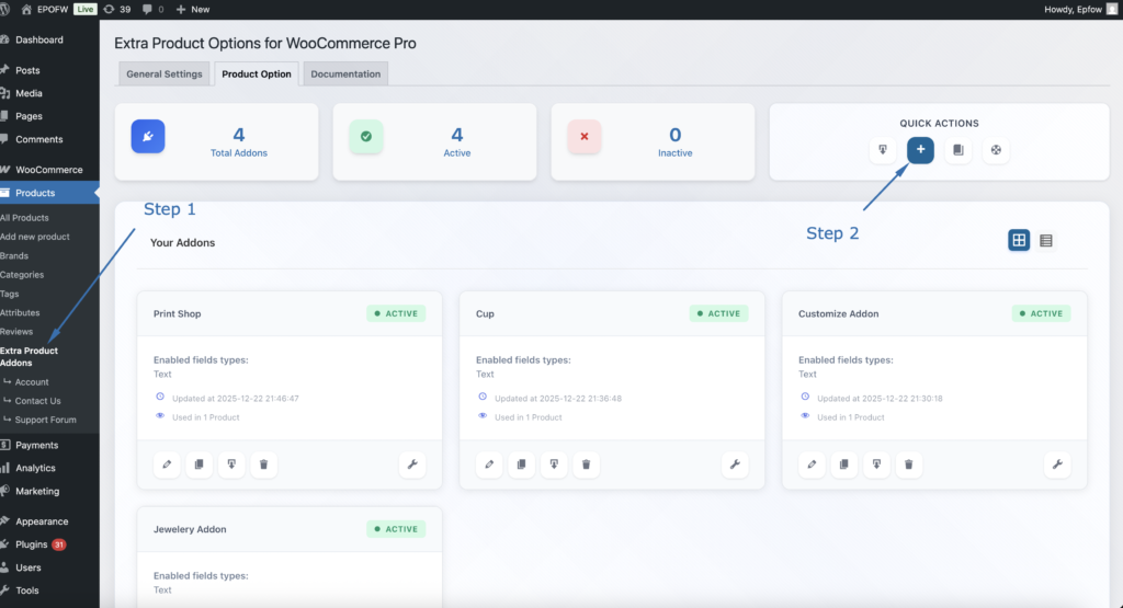
Step 1: Access the Field Builder
- In your WordPress admin, go to WooCommerce > Products > Extra Product Addons
- Click “Add Product Addon” or edit an existing addon
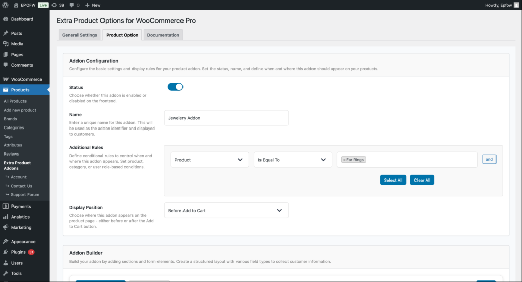
Addon Configuration:
- Status:
- Check the Status checkbox to enable the addon
- Unchecked addons are disabled and won’t appear on product pages
- Enable this to make your fields active
- Name:
- Enter a name for your addon (e.g., “Personalization Options”)
- This name helps you identify the addon in the admin area
- It’s not visible to customers on the frontend
- Additional Rules:
- Configure which products should display this addon
- Product: Select the condition type (Product, Category, Tag, etc.)
- Is Equal To: Choose the comparison operator
- Value: Select specific products, categories, or other criteria
- Use “Select All” or “Clear All” for bulk selection
- Click “and” to add multiple conditions
- Example: Apply to “Product” “Is Equal To” “Silver Ring” to show only on that product
- Display Position:
- Select where the addon fields appear on the product page
- Options include:
- Before Add to Cart (most common)
- After Add to Cart
- Choose the position that works best with your theme layout
Product addons help you organize your extra product options and apply them consistently across your store. Think of them as containers that hold multiple fields for specific products or product types.
Step 2: Add the Image Switcher Field
- In your Addon Builder, click “Add Element/Add Section -> ( + ) Add Element” button
- Select Image Switcher from Select Element Type modal popup
Step 3: Configure General Settings
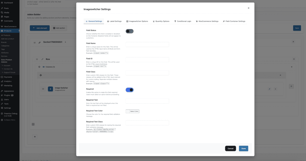
The General Settings tab contains basic field configuration options that control the field’s core functionality and behavior.
The field title is crucial because it’s the first thing customers see. Make it clear and specific to avoid confusion during checkout.
General Settings:
- Field Status:
- What it does
- Controls whether the Image Switcher field is active and visible on the frontend.
- How to use:
- Enable: Field will be displayed on product pages
- Disable: Field will be hidden from customers (useful for testing or temporarily disabling)
- Best practices:
- Keep enabled for active fields
- Disable when testing or making changes
- Use for A/B testing different field configurations
- What it does
- Field Name:
- What it does:
- Sets the internal identifier for the field. This is used for form processing and data storage.
- How to use:
- Enter a unique, descriptive name (e.g.,
fabric_pattern,ring_style,wallpaper_design) - Use lowercase letters, numbers, and underscores only
- Make it descriptive but concise
- Enter a unique, descriptive name (e.g.,
- Example:
fabric_pattern– For fabric selectionring_style– For ring style selectionwallpaper_pattern– For wallpaper pattern selection
- Technical Details:
- Used as the
nameattribute in the HTML form - Must be unique within the addon
- Used for form data processing and cart storage
- Format:
epofw_field_[your_field_name]
- Used as the
- Best practices:
- Use descriptive names that indicate the field’s purpose
- Avoid special characters and spaces
- Keep names consistent across similar fields
- What it does:
- Field ID:
- What it does:
- Sets a custom HTML ID attribute for the field container. Useful for custom CSS targeting and JavaScript integration.
- How to use:
- Enter a unique ID (e.g.,
custom-fabric-selector,ring-style-picker) - Leave empty to use the auto-generated ID
- Use only letters, numbers, hyphens, and underscores
- Enter a unique ID (e.g.,
- Example:
custom-fabric-selector– For custom stylingring-style-picker– For JavaScript integrationwallpaper-pattern-grid– For layout customization
- Best practices:
- Only set if you need custom CSS or JavaScript targeting
- Use descriptive, unique IDs
- Follow HTML ID naming conventions
- What it does:
- Field Class:
- What it does:
- Adds custom CSS classes to the field container. Useful for custom styling and theme integration.
- How to use:
- Enter one or more CSS classes separated by spaces
- Use standard CSS class naming (lowercase, hyphens)
- Leave empty if no custom styling needed
- Example:
custom-image-grid– For custom grid layoutpremium-fabric-selector– For premium stylingresponsive-image-picker– For responsive adjustments
- Best practices:
- Use descriptive class names
- Follow your theme’s CSS naming conventions
- Test custom styles on all devices
- What it does:
- Required:
- The Required setting determines whether customers must fill out the select field before they can add the product to their cart. When enabled, the field becomes mandatory and validation will prevent submission if the field is empty.
- Field Options (Premium):
- Text: Enter custom validation message that appears when the field is empty (e.g., “Please select a fabric pattern”)
- Color For Required Text: Choose the color for the validation message (typically red or orange for errors)
- Required Text Class: Add custom CSS classes to the validation message for additional styling
- Only mark fields as required when the information is truly necessary for order fulfillment. Too many required fields can frustrate customers and reduce conversion rates.
Step 4: Configure Label Settings
The Label Settings tab controls how the field label (title and subtitle) appears to customers. These settings help you create clear, professional field labels that guide customers effectively.
Label Settings
- Label Title:
- What it does:
- Sets the main label text displayed above the Image Switcher field.
- How to use:
- Enter a clear, descriptive label (e.g., “Choose Fabric Pattern”, “Select Ring Style”)
- Make it specific to what customers are selecting
- Keep it concise but informative
- Example:
- “Choose Fabric Pattern”
- “Select Ring Style”
- “Pick Wallpaper Design”
- “Add Design Elements”
- Best practices:
- Enable for clarity and user guidance
- Disable only if the field is self-explanatory
- Always provide labels for accessibility
- What it does:
- Title Type (Premium)
- What it does:
- Sets the HTML tag used for the title, affecting its semantic meaning and default styling.
- Available Options:
- H1: Largest heading (use sparingly, typically one per page)
- H2: Large heading (good for main field labels)
- H3: Medium heading (good for field labels)
- H4: Smaller heading (good for sub-labels)
- H5: Small heading
- H6: Smallest heading
- P: Paragraph text (default styling)
- Label: Form label (semantic for form fields)
- Span: Inline text (minimal styling)
- How to use:
- Select the appropriate heading level based on your page structure
- H2 or H3 are typically best for field labels
- Label is semantically correct for form fields
- Best practices:
- Use H2 or H3 for main field labels
- Maintain proper heading hierarchy (don’t skip levels)
- Use Label for semantic correctness
- Consider your theme’s heading styles
- What it does:
- Title Position (Premium)
- What it does:
- Controls where the label appears relative to the image switcher field.
- How to use:
- Left: Label appears to the left of the field (default)
- Right: Label appears to the right of the field
- Top: Label appears above the field
- Bottom: Label appears below the field
- Best practices:
- Use “Top” for better mobile responsiveness
- Use “Left” for compact desktop layouts
- Test different positions to see what works best for your design
- What it does:
- Title Color (Premium)
- What it does:
- Sets the text color of the label title.
- How to use:
- Choose a color that matches your theme’s typography
- Ensure sufficient contrast for readability (WCAG AA compliance)
- Use colors that guide attention without being distracting
- Best practices:
- Test color choices on different backgrounds
- Consider dark mode compatibility if your theme supports it
- Maintain consistency across all field labels
- What it does:
- Subtitle
- What it does:
- Adds additional descriptive text below the main label to provide more context.
- How to use:
- Enter helpful information that clarifies the field’s purpose
- Use subtitles to explain pricing, features, or important details
- Keep subtitles concise to avoid overwhelming customers
- Example:
- “Click an image to select your preferred pattern”
- “Select one or more design elements to add to your product”
- “Choose the style that best matches your preference”
- Best practices:
- Use subtitles to highlight value propositions
- Include pricing information when relevant
- Keep text short and scannable
- What it does:
- Subtitle Type (Premium)
- What it does:
- Determines the HTML element used for the subtitle (label, h1-h6, span, div, p).
- How to use:
- Label: Standard label element (recommended)
- Heading (h1-h6): Rarely used for subtitles
- Span/Div/P: Use for inline or block-level subtitles
- Best practices:
- Use “label” or “p” for most subtitles
- Match the subtitle type to your theme’s styling
- Ensure proper semantic HTML structure
- What it does:
- Subtitle Class
- What it does:
- Adds custom CSS classes to the subtitle for styling.
- How to use:
- Enter CSS classes separated by spaces
- Use classes that match your theme’s styling
- Test to ensure proper display
- What it does:
- Subtitle Color (Premium)
- What it does:
- Sets the text color of the subtitle.
- How to use:
- Choose a color that’s slightly muted compared to the main label
- Ensure readability while maintaining visual hierarchy
- Match your theme’s secondary text color
- What it does:
- Label Class
- What it does:
- Adds custom CSS classes to the entire label container.
- How to use:
- Enter CSS classes for styling the label wrapper
- Use classes that match your theme’s form styling
- Apply classes that affect both title and subtitle
- What it does:
- Enable Label Styling (Premium)
- What it does:
- Provides advanced typography and styling options for the label.
- Available Options:
- Font Size: Set the label text size in pixels
- Font Weight: Control text boldness (100-900)
- Font Family: Specify custom font families
- Text Align: Control text alignment (left, center, right, justify)
- Text Transform: Control text case (uppercase, lowercase, capitalize, none)
- Letter Spacing: Adjust spacing between characters
- Line Height: Control line spacing for multi-line labels
- Text Shadow: Add text shadow effects
- Custom CSS: Add advanced custom styles
- How to use:
- Enable “Enable Label Styling” to access these options
- Configure typography settings to match your brand
- Use custom CSS for advanced styling needs
- Best practices:
- Maintain readability with appropriate font sizes
- Use consistent typography across all fields
- Test on different devices and screen sizes
- What it does:
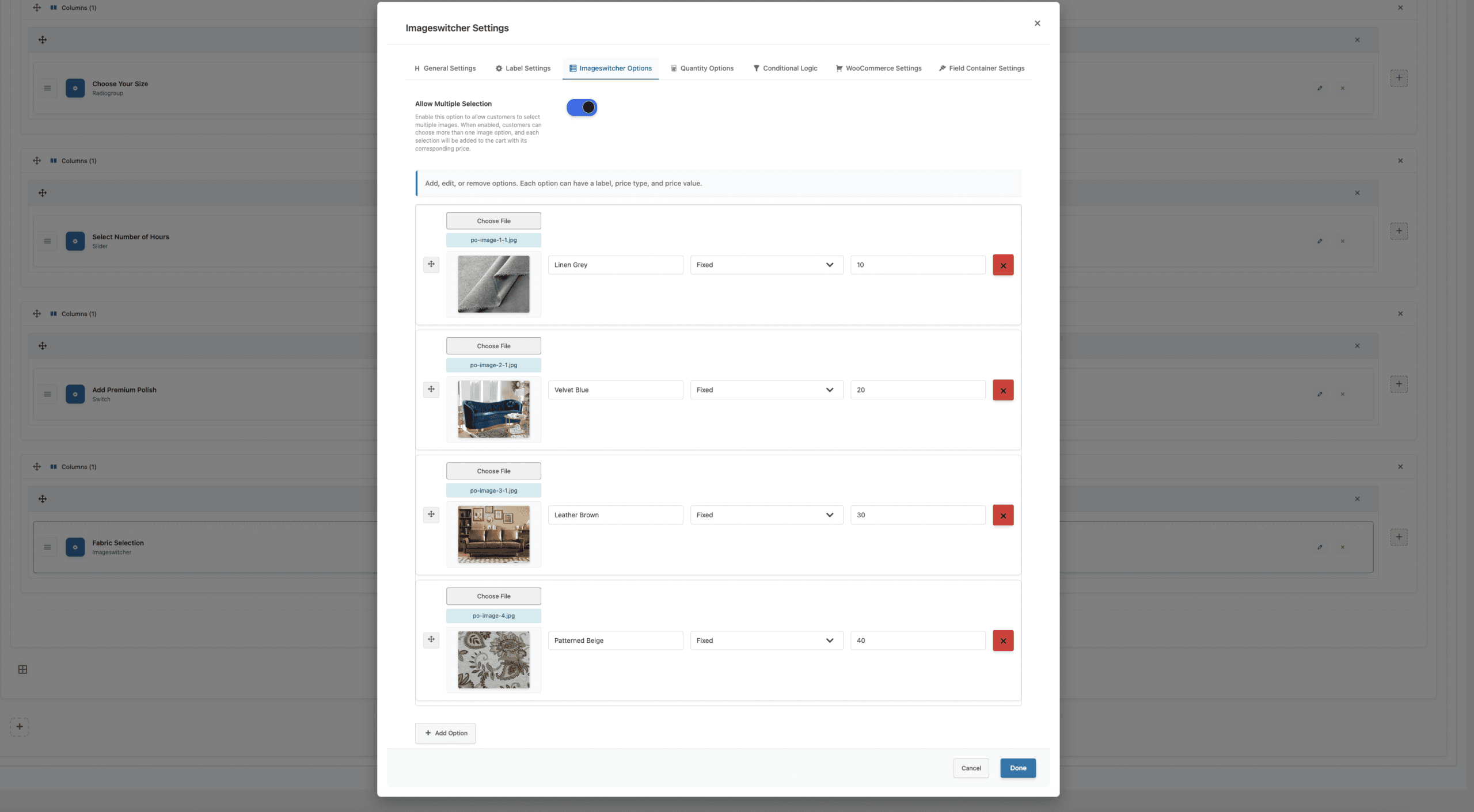
Step 5: Configure ImageSwitcher Options
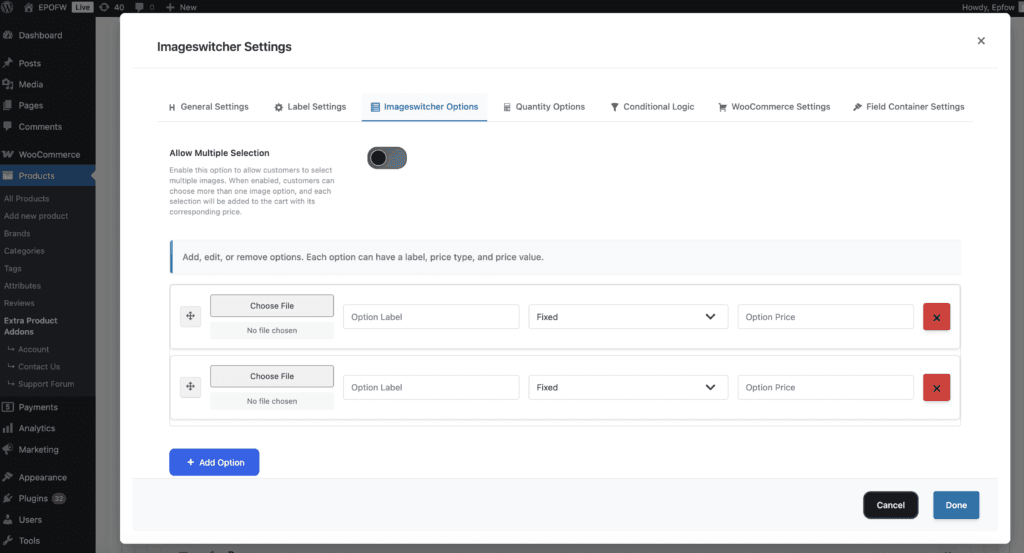
For each image option, you can configure the following settings:
ImageSwitcher Options
- Adding Options
- How to use:
- Click “Add Option” button in the Options Settings tab
- Upload or select an image for the option (150px width recommended)
- Enter the option label (what customers will see)
- Select the price type for this option
- Enter the price value
- Repeat for all options you want to offer
- Example Options Setup:
- Furniture Fabric Example:
- Option 1: Image: [Charcoal Solid fabric swatch], Label: “Charcoal Solid”, Price Type: Fixed, Price: 0
- Option 2: Image: [Navy Stripe fabric swatch], Label: “Navy Stripe”, Price Type: Fixed, Price: 25
- Option 3: Image: [Gray Plaid fabric swatch], Label: “Gray Plaid”, Price Type: Fixed, Price: 35
- Custom T-Shirt Design Example:
- Option 1: Image: [Star Design], Label: “Star Design”, Price Type: Fixed, Price: 5
- Option 2: Image: [Heart Pattern], Label: “Heart Pattern”, Price Type: Fixed, Price: 5
- Option 3: Image: [Logo Badge], Label: “Logo Badge”, Price Type: Fixed, Price: 8
- Furniture Fabric Example:
- How to use:
- Option Image
- What it does:
- The image that customers see and click to select the option. This is the visual representation of the option.
- How to use:
- Click “Choose File” to upload an image from your computer
- Or select an existing image from your media library
- Images are displayed as 150px width thumbnails on the frontend
- Recommended size: 150×150px or 200×200px (square dimensions work best)
- Image Requirements:
- Supported formats: PNG, JPEG, JPG, GIF
- Recommended dimensions: 150×150px or 200×200px (square)
- Maximum file size: Check your WordPress upload limits
- Aspect ratio: 1:1 (square) works best for grid layouts
- Best practices:
- Use high-quality, clear images that accurately represent the option
- Keep images consistent in size and aspect ratio for uniform display
- Use square images (1:1 aspect ratio) for best results in grid layouts
- Optimize images for web (keep under 200KB each for faster loading)
- Use descriptive file names for easier management
- What it does:
- Option Label
- What it does:
- The text that appears below each image option, identifying what the image represents.
- How to use:
- Enter clear, descriptive labels that customers will understand
- Include important information like pricing, features, or specifications
- Keep labels concise to fit below the image
- Example Labels:
- “Charcoal Solid – $0”
- “Navy Stripe – $25”
- “Floral Pattern – $50”
- “Star Design – $5”
- Best practices:
- Use consistent formatting across all options
- Include pricing information in the label when helpful
- Make labels scannable and easy to compare
- Use descriptive names that match the image content
- What it does:
- Option Price Type
- Each option can have its own price type, giving you maximum flexibility:
- Fixed Price
- What it does:
- Adds a fixed amount to the product price when this image option is selected.
- How it works:
- Each option has a fixed price that gets added to the product when selected
- The price is added regardless of the base product price
- Perfect for options with set prices that don’t change
- Example:
- Option: “Navy Stripe” fabric pattern
- Fixed Price: $25
- When customer selects this image, $25 will be added to the base product price
- Useful for: Fabric upgrades, design elements, style variations
- Use cases:
- Fabric pattern selections with fixed upgrade prices
- Design element add-ons with set prices
- Style variations with fixed costs
- Accessory options with fixed pricing
- What it does:
- Percentage of Product Price
- What it does:
- Adds a percentage of the product’s base price when this image option is selected.
- How it works:
- Each option has a percentage that gets calculated based on the product’s base price
- The price scales automatically with the product price
- Perfect for pricing that should scale with product value
- Example:
- Option: “Luxury Material” upgrade
- Percentage: 25%
- For a $500 product, when customer selects this image, $125 will be added (25% of $500)
- For a $1000 product, when customer selects this image, $250 will be added (25% of $1000)
- Useful for: Material upgrades, premium finishes, luxury options
- Use cases:
- Material upgrades that scale with product value
- Premium finishes as percentage of purchase
- Luxury options based on product price
- Service levels based on product value
- What it does:
- Fixed Price
- Each option can have its own price type, giving you maximum flexibility:
- Option Price
- What it does:
- Sets the price amount or percentage value for the image option.
- How to use:
- For Fixed Price: Enter the dollar amount (e.g., 25 for $25)
- For Percentage: Enter the percentage number (e.g., 15 for 15%)
- Do not include currency symbols or percentage signs
- Use decimal values if needed (e.g., 2.50 for $2.50)
- Best practices:
- Enter numbers only, no currency symbols
- Use appropriate decimal precision
- Test pricing calculations to ensure accuracy
- Consider your profit margins when setting prices
- What it does:
- Reordering Options
- How to use:
- Drag and drop options using the move icon (⋮⋮) to reorder them
- Place most popular or recommended options at the top
- Organize options logically (e.g., cheapest to most expensive)
- Best practices:
- Put the most popular option first for better conversion
- Group similar options together
- Consider placing premium options last to encourage upsells
- How to use:
- Removing Options
- How to use:
- Click the remove button (×) next to any option to delete it
- Removed options are immediately deleted from the configuration
- Changes are saved when you save the addon
- Best practices:
- Review options before removing to avoid data loss
- Consider disabling options instead of removing if you might need them later
- Test the field after removing options to ensure proper functionality
- How to use:
Real-World Examples
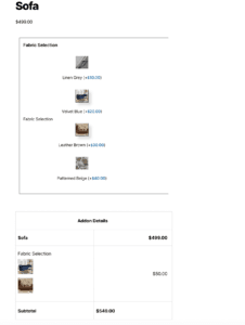
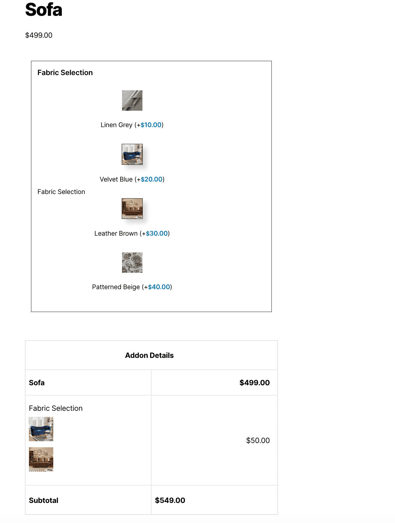
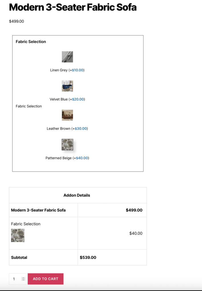
Furniture Fabric Selection (Single)
Scenario: Furniture store offers sofas in different fabric patterns. Customer must choose one.
Configuration:
- Field Type: Image Switcher
- Field Label: “Choose Fabric Pattern”
- Allow Multiple: OFF (Single selection)
- Required: Yes
Options Setup:
| Option Label | Image | Price |
|---|---|---|
| Charcoal Solid | [fabric swatch] | 0.00 |
| Navy Stripe | [fabric swatch] | 25.00 |
| Gray Plaid | [fabric swatch] | 35.00 |
| Floral Pattern | [fabric swatch] | 50.00 |
| Velvet Texture | [fabric swatch] | 75.00 |
Customer Experience:
- Base sofa: $899.00
- Clicks image: Floral Pattern
- Final price: $949.00
- Only ONE fabric can be selected (radio behavior)
Scenario: Custom t-shirt with multiple add-on design elements that can be combined.
Configuration:
- Field Type: Image Switcher
- Field Label: “Add Design Elements”
- Allow Multiple: ON (Multiple selections)
- Required: No
Options Setup:
| Option Label | Image | Price |
|---|---|---|
| Star Design | [design image] | 5.00 |
| Heart Pattern | [design image] | 5.00 |
| Logo Badge | [design image] | 8.00 |
| Text Monogram | [design image] | 10.00 |
| Custom Artwork | [design image] | 15.00 |
Customer Experience:
- Base t-shirt: $24.99
- Clicks images: Star Design + Logo Badge + Text Monogram
- Total add-ons: $5 + $8 + $10 = $23.00
- Final price: $47.99
- Multiple images can be selected (checkbox behavior)
Design Add-Ons (Multiple)
Wallpaper Pattern Selection
Scenario: Home decor store offers wallpaper with visual pattern previews.
Configuration:
- Field Type: Image Switcher
- Field Label: “Select Pattern”
- Allow Multiple: OFF (Single selection)
- Required: Yes
Options Setup:
| Option Label | Image | Price Type | % | On $200 |
|---|---|---|---|---|
| Classic Stripes | [pattern image] | Percentage | 0% | 0.00 |
| Modern Geometric | [pattern image] | Percentage | 10% | 20.00 |
| Floral Garden | [pattern image] | Percentage | 15% | 30.00 |
| Abstract Art | [pattern image] | Percentage | 20% | 40.00 |
What Your Customers See
When customers visit your product page, they’ll see:
Image Thumbnails Displayed – All option images are visible in a grid layout (150px width)
Clickable Images – Customers click directly on images to select
Visual Feedback – Selected images show a visual indicator (border, highlight, or checkmark)
Label and Price Visible – Each image shows its label and price below
Selection Behavior – Single selection (radio) or multiple selections (checkbox) based on “Allow Multiple” setting
Real-Time Pricing – Product price updates instantly when images are selected/deselected
Cart Display – Selected images and their prices appear in the cart
Frontend Display:
- Customers can easily see and compare visual options
- Clicking images is intuitive and engaging
- Pricing is transparent and updates in real-time
- The interface is modern and professional
- Works seamlessly on all devices
Tips for Creating Effective Imageswicther Fields
Creating an effective Imageswicther Field involves balancing flexibility with control. Consider these best practices to ensure your Imageswicther fields provide excellent user experience while collecting high-quality data.
- Image Quality
- Use high-quality images – Clear, well-lit images that accurately represent the option
- Keep images consistent – Use same size/aspect ratio for all options (e.g., 150×150px or 200×200px)
- Use square images – Square thumbnails look best in grid layouts
- Optimize file sizes – Compress images for faster loading (keep under 200KB each)
- Test image display – Ensure images load quickly and display correctly on all devices
- Selection Behavior
- Set “Allow Multiple” correctly – OFF for single choice, ON for multiple add-ons
- Test both modes – Try single and multiple selection to see which works better
- Consider your use case – Mutually exclusive options = single, additive options = multiple
- Performance
- Optimize images before uploading – Compress files to reduce load times
- Use appropriate image dimensions – 150×150px or 200×200px works well
- Limit number of options – Too many images can slow down the page
- Test page load times – Ensure images load quickly for good user experience
- Label Clarity
- Write descriptive labels – Help customers understand what each image represents
- Include pricing when helpful – Show prices in labels for transparency
- Keep labels concise – Short labels fit better below images
- Use consistent formatting – Maintain the same style across all options
- Pricing Strategy
- Use Fixed Price for set costs – When prices don’t change based on product value
- Use Percentage for scalable pricing – When prices should scale with product price
- Test pricing calculations – Verify prices calculate correctly before going live
- Consider profit margins – Set prices that maintain your desired profit margins
Advanced Features
- Enable Quantity
- What it does
- Adds quantity input for selected image option(s), allowing customers to specify how many of each selected option they want.
- How to use:
- Enable this option to show quantity inputs for each selected image
- Customers can adjust quantity for each selected option
- Pricing is multiplied by the quantity selected
- Example:
- Customer selects “Star Design” image with quantity 3
- Price: $5 × 3 = $15.00
- Best practices:
- Enable for options where quantity matters
- Disable for single-use options
- Test quantity calculations to ensure accuracy
- What it does
- Product Quantity
- What it does
- Links addon quantity to the main product quantity, so addon quantities automatically match the product quantity.
- How to use:
- Enable this option to sync addon quantities with product quantity
- When customer changes product quantity, addon quantities update automatically
- Useful for options that should match product quantity
- Example:
- Product quantity: 2
- Selected image option quantity: Automatically set to 2
- If product quantity changes to 3, addon quantity updates to 3
- What it does
- Default Quantity
- What it does
- Sets the initial quantity value for selected image options.
- How to use:
- Enter the default quantity (typically 1)
- This value is used when customers first select an option
- Customers can adjust the quantity after selection
- Example:
- Set to 1 for most use cases
- Set higher defaults for bulk options
- Test default quantities to ensure they make sense
- What it does
- Min/Max Quantity
- What it does
- Controls the minimum and maximum quantity limits for selected image options.
- How to use:
- Set minimum quantity to prevent zero or negative quantities
- Set maximum quantity to limit how many can be selected
- Leave empty for no limits
- Example:
- Min Quantity: 1 (at least 1 must be selected)
- Max Quantity: 10 (no more than 10 can be selected)
- Best practices:
- Set minimums to prevent invalid quantities
- Set maximums to prevent excessive orders
- Test limits to ensure they work correctly
- What it does
- Conditional Logic
- What it does
- Show or hide the image switcher field based on other field selections, enabling dynamic form behavior.
- How to use:
- Set conditions based on other field values
- Show field only when certain conditions are met
- Hide field when conditions are not met
- Example:
- Show “Design Elements” image switcher only when “Custom Design” checkbox is selected
- Hide “Premium Patterns” image switcher when “Basic Package” is selected
- Best practices:
- Use conditional logic to simplify complex forms
- Test all condition combinations
- Ensure fields appear/disappear correctly
- What it does
Free vs Premium
Free Version Includes:
- The Image Switcher Field is available exclusively in the Premium version of Extra Product Options for WooCommerce. This advanced field type is not included in the free version.
Premium Version Adds:
- Complete image switcher functionality
- Single selection mode (radio behavior)
- Multiple selection mode (checkbox behavior)
- Fixed pricing for options
- Percentage-based pricing for options
- Image upload and display
- Real-time price updates
- Conditional logic support
- Quantity options for selected images
- Hide in cart options
- Advanced customization features
Troubleshooting
Images Not Uploading or Showing Error
- Ensure images are in supported formats (PNG, JPEG, JPG, GIF)
- Check file size limits in WordPress settings
- Verify WordPress upload permissions are set correctly
- Try uploading smaller images (under 200KB each)
- Check for JavaScript errors in browser console
Images Appear Stretched or Distorted
- Use square images (1:1 aspect ratio) like 150×150px or 200×200px
- Ensure all images have the same dimensions for consistent display
- Check your theme’s CSS for image styling conflicts
- Test images on different screen sizes
Images Load Slowly or Page Performance is Poor
- Optimize images before uploading (compress files to keep under 200KB each)
- Use image optimization plugins or tools to reduce file size
- Consider using smaller image dimensions (150×150px instead of 200×200px)
- Limit the number of image options if possible
- Test page load times and optimize as needed
Customers Can Select Multiple Images When Only One Should Be Allowed
- Check the “Allow Multiple Selection” setting in General Settings
- * Ensure it’s set to OFF for single selection (radio behavior)
- * Clear browser cache and refresh the page
- * Check for JavaScript conflicts that might affect selection behavior
Selected Images Don’t Show Visual Feedback
- This is typically a CSS styling issue
- Check your theme’s CSS or add custom styles to highlight selected images
- Use borders, shadows, or opacity changes to indicate selection
- Test on different browsers to ensure compatibility
Pricing Not Calculating Correctly
- Verify “Enable Pricing” is enabled in Pricing Settings
- Check that price values are entered correctly (numbers only, no currency symbols)
- Ensure price types are selected correctly for each option
- Test with different price types to isolate the issue
- Check for JavaScript errors in browser console
Frequently Asked Questions
Still have a question?
Conclusion
The Image Switcher Field (available in the Premium version) provides one of the most intuitive and engaging ways for customers to make product selections. By allowing shoppers to choose options visually rather than through standard text-based dropdowns, it significantly improves the shopping experience and reduces selection errors.
With flexible pricing rules, multi-selection support, conditional logic, and full design customization, the Image Switcher Field is ideal for products that rely heavily on visual representation—such as apparel, accessories, bundles, prints, materials, and style variations.
It enhances both user satisfaction and product clarity while helping store owners present options in a clean, modern, and conversion-focused layout.
With Extra Product Options for WooCommerce Premium, creating dynamic, visually engaging, and fully customizable image-based options becomes effortless for any WooCommerce store. Upgrade to Premium to unlock the Image Switcher Field and many other advanced features.