ColorSwatches
Introduction
Visual color selection is crucial for WooCommerce stores selling products where color matters. When customers can see the exact color they’re choosing—whether it’s a t-shirt, furniture fabric, or phone case—they make more confident purchasing decisions. WooCommerce color swatches transform text-based color dropdowns into visual, clickable color selections that improve customer experience and significantly reduce returns.
Instead of asking customers to imagine what “Midnight Blue” or “Dusty Rose” looks like, WooCommerce color swatches show them the actual colors. This visual approach eliminates guesswork, increases confidence, and leads to fewer returns and higher customer satisfaction.
In this comprehensive guide, we will explain what WooCommerce color swatches are, explore why they’re essential for your store, show you how to implement color switcher fields step-by-step, and provide best practices for creating effective visual color selection experiences.
What Is WooCommerce Color Switcher?
WooCommerce color switcher (also called color swatches) is a field type that displays product color options as clickable visual color squares instead of text dropdowns or radio buttons. Customers see actual color swatches and click to select their choice, making color selection faster and more intuitive.
Key Characteristics:
- Visual Color Swatches: Display actual colors as 50×50 pixel circular swatches
- Color Picker Integration: Admin uses a native color picker to select exact colors
- Hex Code Display: Colors are stored and displayed with hex codes (e.g., #FF5733)
- Single Selection: Radio button behavior—customers select one color
- Per-Option Pricing: Each color can have its own price adjustment
- Cart Display: Selected color shows in cart with color square, name, and hex code
- Active State Indication: Selected swatch displays with blue border highlight
WooCommerce color switcher transforms static color dropdowns into dynamic, visual interfaces that help customers make informed color choices quickly and confidently.
Why Your Store Needs Color Swatches
- Visual Clarity and Accuracy
- Text color names mean different things to different people. “Midnight Blue” to one person might be navy to another, or even purple to someone else. WooCommerce color swatches eliminate this ambiguity by showing the exact color customers will receive.
- WooCommerce color swatches provide visual confirmation that eliminates customer confusion and ensures everyone sees the same color before purchasing.
- Faster Selection Process
- Visual color processing is faster than reading text. Customers can scan color swatches in seconds and make selections without reading through dropdown menus or imagining what each color name represents.
- WooCommerce color swatches make color selection nearly instantaneous, reducing the time customers spend on product pages and improving overall shopping experience.
- Reduced Returns and Exchanges
- When customers can see the actual color before purchasing, they’re significantly less likely to return products because the color doesn’t match their expectations. This reduces return rates, exchange requests, and customer service inquiries.
- WooCommerce color swatches help set accurate expectations, ensuring customers receive products that match their visual color selections.
- Better Mobile Experience
- On mobile devices, tapping a color swatch is much easier and more intuitive than navigating dropdown menus or selecting small radio buttons. WooCommerce color swatches provide a touch-friendly interface optimized for mobile shopping.
- WooCommerce color swatches create a better mobile shopping experience that encourages purchases on smartphones and tablets.
- Professional Appearance
- Color swatches create a modern, professional appearance that builds trust with customers. Stores using WooCommerce color swatches appear more polished and customer-focused than those relying solely on text color options.
- Increased Conversion Rates
- Visual color selection makes the customization process more engaging and less intimidating. Customers are more likely to complete purchases when they can see their color options clearly rather than imagining them from text descriptions.
- WooCommerce color swatches can increase conversion rates by making color selection easier and more appealing.
Use Cases for Color Swatches
- Apparel & Fashion
- WooCommerce color swatches are essential for fashion and apparel stores:
- T-Shirt and Clothing Colors: Show actual fabric colors for t-shirts, shirts, dresses, and pants
- Shoe Colors: Display shoe color options for sneakers, boots, and sandals
- Bag and Accessory Colors: Show handbag, backpack, and accessory color variations
- Hat Colors: Display cap, beanie, and hat color options
- Textile Colors: Show fabric color options for custom clothing
- WooCommerce color swatches are essential for fashion and apparel stores:
- Home & Furniture
- Home and furniture stores benefit from visual color selection:
- Furniture Fabric Colors: Display upholstery and fabric color options for sofas, chairs, and cushions
- Paint Color Options: Show wall paint, furniture paint, and decor color choices
- Curtain and Bedding Colors: Display curtain, bedding, and home textile color variations
- Rug and Carpet Colors: Show rug, carpet, and flooring color options
- Home and furniture stores benefit from visual color selection:
- Electronics & Accessories
- Electronics stores use WooCommerce color swatches for:
- Phone Case Colors: Display phone case color options for different models
- Laptop Skin Colors: Show laptop skin and sticker color variations
- Headphone Colors: Display headphone and earbud color options
- Watch Band Colors: Show watch band and strap color choices
- Accessory Finishes: Display tech accessory color and finish options
- Electronics stores use WooCommerce color swatches for:
- Jewelry & Accessories
- Jewelry businesses use color swatches for:
- Metal Finishes: Show gold, silver, rose gold, platinum, and other metal finishes
- Gemstone Colors: Display gemstone color options (though patterns may work better with Image Switcher)
- Enamel Colors: Show enamel color options for jewelry pieces
- Chain and Band Colors: Display chain and band finish colors
- Jewelry businesses use color swatches for:
- Promotional Products
- Promotional product businesses use color swatches for:
- Custom Merchandise Colors: Display color options for custom t-shirts, mugs, and products
- Corporate Branded Items: Show brand color options for corporate merchandise
- Event Giveaway Colors: Display color options for event swag and giveaways
- Logo Product Colors: Show color variations for products with custom logos
- Promotional product businesses use color swatches for:
- Art & Craft Supplies
- Art and craft supply stores benefit from color swatches:
- Paint Colors: Display paint color options for acrylics, watercolors, and oils
- Yarn Colors: Show yarn color options for knitting and crochet projects
- Fabric Swatches: Display fabric color options for sewing projects
- Paper Colors: Show paper and cardstock color options for crafting
- Art and craft supply stores benefit from color swatches:
Color Switcher Features Overview (Free vs Premium)
| Feature | Free | Premium |
|---|---|---|
| Basic Color Switcher | ❌ | ✅ |
| Color Picker | ❌ | ✅ |
| Visual Color Swatches | ❌ | ✅ |
| Hex Code Support | ❌ | ✅ |
| Per-Color Pricing | ❌ | ✅ |
| Option Labels | ❌ | ✅ |
| Drag-and-Drop Ordering | ❌ | ✅ |
| Cart Display with Color | ❌ | ✅ |
| Active State Indication | ❌ | ✅ |
| Conditional Logic Integration | ❌ | ✅ |
Premium Version Features
The premium version of WooCommerce color switcher includes all color selection features:
- Native Color Picker: Admin uses browser’s native color picker for easy color selection
- Visual Swatches: 50×50 pixel circular color swatches displayed on product pages
- Hex Code Storage: Colors stored with hex codes for accurate representation
- Single Selection: Radio button behavior—one color selection per field
- Per-Option Pricing: Each color can have fixed or percentage-based price adjustments
- Option Labels: Descriptive names for each color (e.g., “Navy Blue”, “Forest Green”)
- Drag-and-Drop Ordering: Easy reordering of color options in admin
- Cart Integration: Selected color displays in cart with color square, name, and hex code
- Active State: Selected swatch highlighted with blue border
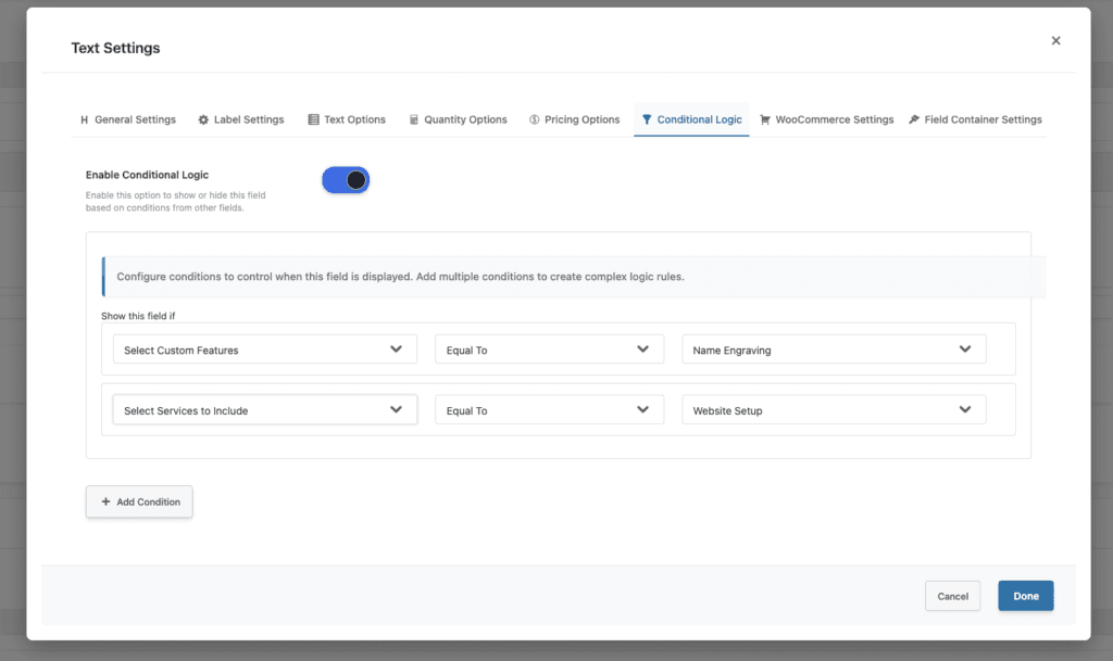
- Conditional Logic: Show/hide colors based on other field selections or product conditions
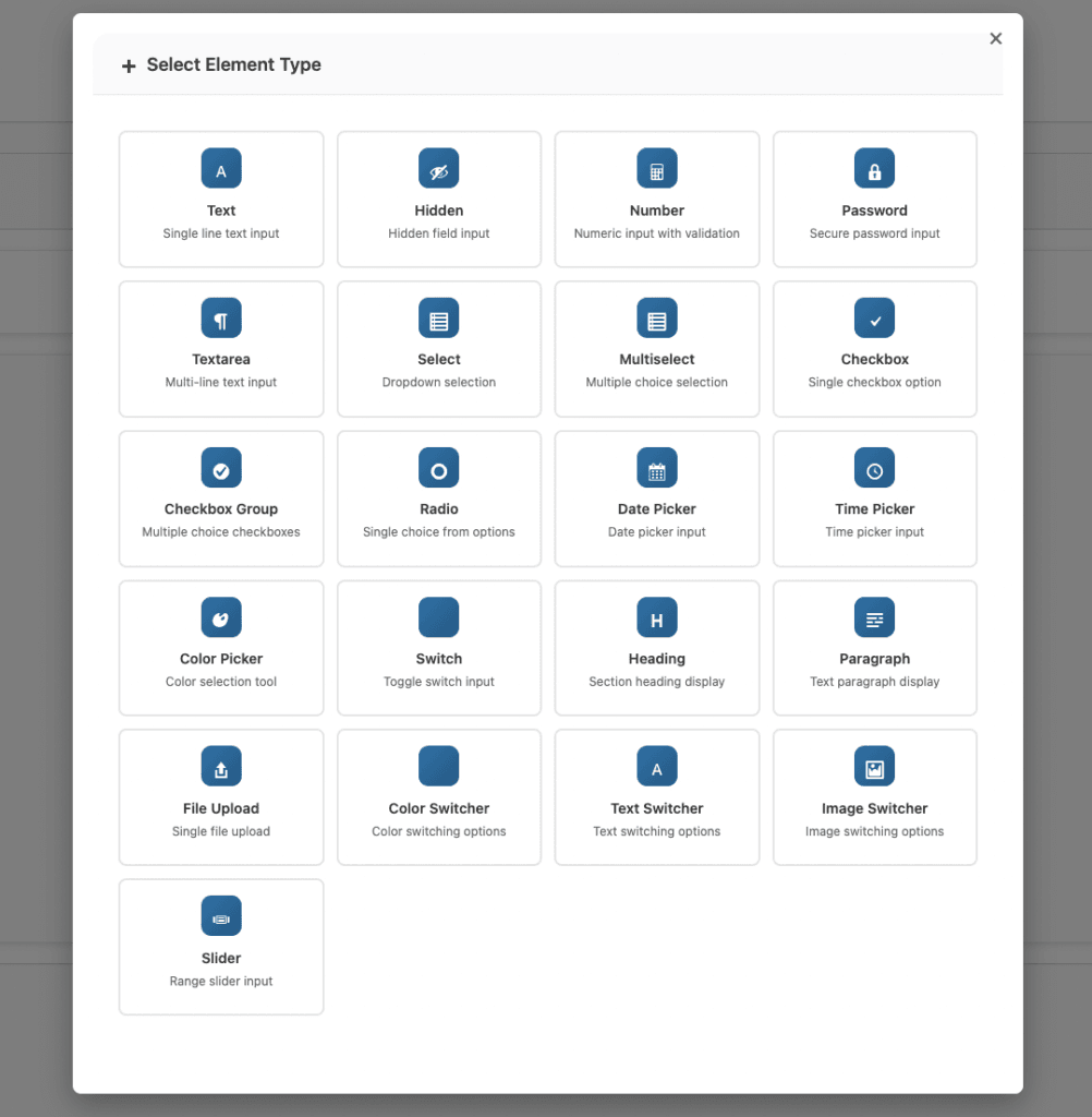
How to Add Color Switcher Fields (Step-by-Step)
Note: Color Switcher is a Premium-only feature of Extra Product Options for WooCommerce.
- Step 1: Create an Options Group
- Go to WooCommerce → Product Addons in your WordPress admin dashboard
- Click Add New to create a new options group
- Give it a descriptive name like “Color Selection” or “Product Colors”
- Configure general settings for the options group if needed
- Step 2: Add a Color Switcher Field
- In the addon builder, scroll down to the Additional Rules section
- Click to expand the display rules configuration panel
- You’ll see options for setting up conditional display rules
- Step 3: Add Color Options – For each color option, configure the following settings:
- Click Add Option to create a new color option
- Color Picker: Click the color input to open the native color picker
- Select from the color spectrum visually
- Enter a specific hex code directly (e.g., #FF5733)
- Use the eyedropper tool if supported by your browser
- Option Label: Enter a descriptive name for the color
- Good examples: “Navy Blue”, “Forest Green”, “Coral Pink”
- Avoid: “Color 1”, “Option A”, generic names
- Price Type: Choose how price adjustment is calculated
- Fixed: Adds a specific amount (e.g., +$5.00)
- Percentage: Adds percentage of base price (e.g., +10%)
- Leave empty if no price adjustment needed
- Price: Enter the price adjustment amount (if applicable)
- Step 4: Add Multiple Colors
- Click Add Option for each additional color you want to offer
- Use the color picker to select each color accurately
- Enter descriptive labels for each color
- Set pricing if certain colors cost more (premium dyes, limited availability)
- Drag options using the move handle to reorder colors logically
- Tips for Adding Colors:
- Use actual product photos to sample exact colors
- Test swatches on different monitors for accuracy
- Consider how colors appear in different lighting
- Limit to 6-12 colors maximum to avoid overwhelming customers
- Step 5: Configure Display Rules (Optional)
- Set up Additional Rules to control where colors appear:
- Product Conditions: Show colors on specific products only
- Category Conditions: Display colors for products in certain categories
- Tag Conditions: Show colors for products with specific tags
- User Role Conditions: Display different colors for different customer segments
- Use conditional logic to show relevant colors based on other selections
- Set up Additional Rules to control where colors appear:
- Step 6: Save and Test
- Click Save Addon to save your color switcher configuration
- Visit your product page to see the color swatches
- Test color selection by clicking different swatches
- Verify the selected color appears correctly in the cart
- Check that pricing adjustments work if configured
- Test on mobile devices to ensure touch-friendly interface
Color Switcher Settings Explained
- Color Picker
- The admin interface uses a native browser color picker for selecting colors:
- How to Use:
- Click the color input field to open the color picker
- Visual Selection: Click anywhere on the color spectrum to select a color
- Hex Code Input: Type or paste a hex code directly (e.g., #FF5733)
- Eyedropper Tool: Use browser’s eyedropper to sample colors from your screen (if supported)
- Best Practices:
- Use product photos to sample exact colors
- Verify hex codes match product colors accurately
- Test swatches on different monitors and devices
- Consider color accuracy across different displays
- Option Labels
- Give each color a clear, descriptive name that helps customers understand what they’re choosing:
- Good Label Examples:
- “Navy Blue” (specific shade)
- “Forest Green” (descriptive)
- “Coral Pink” (clear color description)
- “Charcoal Gray” (precise naming)
- Avoid These:
- “Color 1”, “Color 2” (not descriptive)
- “Option A”, “Option B” (meaningless)
- Generic names like “Blue”, “Red” (too vague if multiple shades exist)
- Label Best Practices:
- Use descriptive, specific names
- Match industry-standard color names when possible
- Include shade or tone indicators when multiple similar colors exist
- Consider customer understanding and search terms
- Pricing per Color
- Some colors may cost more due to premium materials, limited availability, or special finishes:
- Price Type Options:
- Fixed Amount: Adds a specific dollar amount (e.g., +$5.00)
- Use when the cost difference is constant regardless of product price
- Example: Premium dye adds $5 to any product
- Percentage: Adds a percentage of the base product price (e.g., +10%)
- Use when the cost scales with product price
- Example: 10% upcharge on premium colors for expensive items
- Fixed Amount: Adds a specific dollar amount (e.g., +$5.00)
- Pricing Transparency:
- Show price differences clearly to customers
- Explain why certain colors cost more (premium materials, limited edition)
- Don’t hide upcharges—be transparent about pricing
- Consider offering some colors at no extra charge to maintain value perception
Best Practices for Color Swatches
- Use Accurate Color Codes
- The color swatch should match the actual product as closely as possible:
- Sample from Product Photos: Use actual product images to sample exact colors
- Test on Multiple Monitors: Colors may appear different on various displays
- Consider Lighting: Account for how colors appear in different lighting conditions
- Verify Hex Codes: Double-check hex codes match physical products
- WooCommerce color swatches work best when customers see the exact color they’ll receive.
- The color swatch should match the actual product as closely as possible:
- Name Colors Descriptively
- Best Usage
- Instead of Blue Use Ocean Blue, Navy, Sky Blue
- Instead of Red Use Crimson, Cherry, Burgundy
- Instead of Green Use Forest, Mint, Olive
- Instead of Gray Use Charcoal, Silver, Slate
- Instead of Yellow Use Golden, Buttercup, Lemon
- Benefits:
- Customers can find colors by name
- Search engines can index color names
- Reduces confusion between similar shades
- Improves accessibility for color-blind users
- Best Usage
- Limit Color Options
- Too many colors can overwhelm customers and slow decision-making:
- Optimal Range: Offer 6-12 colors maximum per product
- Group Similar Shades: Consider consolidating very similar colors
- Seasonal Selection: Offer different color sets for different seasons
- Popular Colors First: Display best-selling colors prominently
- Why Limit Options:
- Reduces decision paralysis
- Faster selection process
- Better mobile experience (fewer swatches to scroll)
- Cleaner, more professional appearance
- Too many colors can overwhelm customers and slow decision-making:
- Consider Color Accessibility
- Some customers have color vision deficiency or color blindness:
- Use Descriptive Labels: Don’t rely on color alone—labels are crucial
- Ensure Contrast: Make sure swatches have sufficient contrast with backgrounds
- Color-Blind Friendly: Test swatches to ensure they’re distinguishable for color-blind users
- Text Indicators: Consider adding text or patterns for accessibility
- Accessibility Best Practices:
- Always include descriptive color names
- Ensure swatches are large enough to distinguish
- Use patterns or textures in addition to colors when possible
- Test with accessibility tools
- Some customers have color vision deficiency or color blindness:
- Order Colors Logically
- Arrange colors in a way that makes sense to customers:
- Ordering Strategies:
- Light to Dark: Organize from lightest to darkest shades
- Rainbow Spectrum: Follow natural color spectrum (red, orange, yellow, green, blue, purple)
- Popular First: Display best-selling colors first
- Seasonal Grouping: Group seasonal colors together (e.g., summer colors, winter colors)
- Neutral to Bold: Start with neutrals, end with bold colors
- Benefits of Logical Ordering:
- Easier for customers to find desired colors
- More professional appearance
- Faster selection process
- Better user experience
- Ordering Strategies:
- Arrange colors in a way that makes sense to customers:
- Price Premium Colors Transparently
- If certain colors cost more, be transparent about pricing:
- Show Price Differences: Clearly display upcharges on color swatches
- Explain Why: Mention reasons for premium pricing (premium materials, limited edition)
- Don’t Hide Costs: Avoid surprising customers with unexpected charges
- Offer Value: Consider including some premium colors at no extra charge
- Transparency Builds Trust:
- Customers appreciate honesty about pricing
- Reduces cart abandonment from unexpected costs
- Builds trust and customer loyalty
- Sets proper expectations
- If certain colors cost more, be transparent about pricing:
- Combine with Conditional Logic
- Show relevant colors based on other product selections:
- Product-Specific Colors: Display different colors for different product types
- Material-Based Colors: Show color options relevant to selected materials
- Size-Dependent Colors: Display available colors based on selected sizes
- Hide Out-of-Stock Colors: Use conditional logic to hide unavailable colors
- WooCommerce color swatches work even better when combined with display rules and conditional logic.
- Show relevant colors based on other product selections:
Common Mistakes to Avoid
- Mistake 1: Using Inaccurate Color Codes
- Problem: Color swatches don’t match actual product colors.
- Impact: Customers receive products with unexpected colors, leading to returns and dissatisfaction.
- Solution:
- Sample colors directly from product photos
- Test swatches on multiple monitors
- Verify colors match physical products
- Update colors if products change
- Mistake 2: Generic Color Names
- Problem: Using vague names like “Blue” or “Color 1” instead of descriptive names.
- Impact: Customers can’t distinguish between similar colors, leading to confusion and incorrect selections.
- Solution:
- Use specific, descriptive color names
- Include shade or tone indicators
- Match industry-standard naming conventions
- Consider what customers would search for
- Mistake 3: Too Many Color Options
- Problem: Offering 20+ color options overwhelms customers.
- Impact: Decision paralysis, slower selection process, increased cart abandonment.
- Solution:
- Limit to 6-12 colors maximum
- Group very similar shades together
- Consider seasonal color rotations
- Prioritize popular colors
- Mistake 4: Ignoring Mobile Experience
- Problem: Not testing color swatches on mobile devices.
- Impact: Poor mobile experience, difficult color selection, lost mobile sales.
- Solution:
- Test color selection on mobile devices
- Ensure swatches are touch-friendly (adequate size)
- Verify layout works on small screens
- Check color visibility on mobile displays
- Mistake 5: Hidden Upcharges
- Problem: Not clearly displaying when colors cost more.
- Impact: Customer surprise at checkout, cart abandonment, negative reviews.
- Solution:
- Always display price differences clearly
- Explain why certain colors cost more
- Show upcharges before color selection
- Be transparent about all pricing
- Mistake 6: Poor Color Contrast
- Problem: Color swatches blend into background or are hard to distinguish.
- Impact: Difficult color selection, accessibility issues, customer frustration.
- Solution:
- Ensure sufficient contrast between swatches and background
- Use borders or shadows to separate swatches
- Test with accessibility tools
- Ensure selected state is clearly visible
Troubleshooting Color Switcher Issues
- Issue 1: Colors Don’t Display Correctly
- Symptoms: Color swatches show wrong colors or don’t display at all.
- Possible Causes:
- Incorrect hex codes entered
- CSS conflicts hiding swatches
- Theme compatibility issues
- Cache showing old colors
- Solutions:
- Verify hex codes are correct in admin (should be 6 characters, e.g., #FF5733)
- Clear browser and WordPress cache
- Check for CSS conflicts in theme or other plugins
- Test with default theme to isolate theme issues
- Verify color picker is saving colors correctly
- Issue 2: Color Not Appearing in Cart
- Symptoms: Selected color doesn’t show in cart or order details.
- Possible Causes:
- Cart integration not working
- Theme template overrides
- Plugin conflicts
- Missing cart display code
- Solutions:
- Verify plugin is up to date
- Check WooCommerce template overrides
- Test with default WooCommerce theme
- Check for plugin conflicts by deactivating other plugins temporarily
- Contact plugin support if issue persists
- Issue 3: Color Picker Not Working in Admin
- Symptoms: Can’t select colors using the color picker in admin.
- Possible Causes:
- Browser compatibility issues
- JavaScript conflicts
- Admin theme issues
- Plugin conflicts
- Solutions:
- Try a different browser (Chrome, Firefox, Safari)
- Clear browser cache and cookies
- Disable browser extensions temporarily
- Check browser console for JavaScript errors
- Verify you can enter hex codes directly if picker fails
- Issue 4: Selected Color Highlight Not Visible
- Symptoms: Can’t tell which color is selected (no blue border highlight).
- Possible Causes:
- CSS conflicts overriding active state styles
- Theme styles conflicting
- Missing CSS for active state
- Solutions:
- Check for CSS conflicts in theme
- Inspect element to see if active class is applied
- Add custom CSS if needed to ensure selected state is visible
- Test with default theme to verify functionality
- Issue 5: Colors Look Different on Mobile
- Symptoms: Color swatches appear differently on mobile vs desktop.
- Possible Causes:
- Screen color calibration differences
- Mobile browser color rendering
- Display settings differences
- Solutions:
- This is normal—colors may appear slightly different on different devices
- Use accurate hex codes for best results across devices
- Test on multiple devices to understand variations
- Consider adding color name descriptions for clarity
Conclusion
WooCommerce color swatches are a powerful feature that transforms text-based color selection into visual, intuitive color choosing experiences. By displaying actual color swatches instead of dropdown menus, you can improve customer confidence, reduce returns, and increase conversion rates.
Whether you’re selling apparel, furniture, electronics, or any product where color matters, WooCommerce color swatches provide the visual clarity customers need to make confident purchasing decisions.
Remember to use accurate color codes, descriptive names, limit options appropriately, and be transparent about pricing. With proper configuration and best practices, WooCommerce color swatches can significantly enhance your store’s functionality and customer experience.
Related Resources
Frequently Asked Questions
Find answers to commonly asked questions about our products and services.
Still have a question?
If you have any other queries, feel free to reach out to us. Our knowledgeable team is here to help!