

Checkbox Field
Create powerful checkbox selection fields for your WooCommerce products with WPActPro’s Checkbox Field option. Allow customers to select multiple add-ons, upgrades, or optional features independently like warranties, gift wrapping, premium support, or any combination of extras directly on your product pages.
What is the Checkbox Field?
The Checkbox Field allows customers to select one or more additional options on your product pages. It’s perfect for offering add-ons, extras, upgrades, or any supplementary choices where customers can select multiple items independently. Each checkbox option can have its own pricing, making it extremely flexible for both simple and advanced product setups.
Unlike standard WooCommerce product fields, Extra Product Options for WooCommerce’s Checkbox Field includes advanced features that give you complete control over customer selections::
- Multiple Selections: Customers can choose one, several, or all available options
- Independent Choices: Each option can be selected without affecting others
- Individual Pricing: Each checkbox option can have its own price type (Fixed, Percentage, Custom Formula)
- Transparent Pricing: Each option clearly shows its individual cost
- Flexible Configuration: Control field behavior, appearance, and validation through comprehensive settings
- Real-Time Price Updates: Prices update automatically as customers select or deselect options
- Revenue Optimization: Increase order value through strategic add-ons
Whether you’re selling product add-ons, service upgrades, warranty extensions, or any product that needs optional supplementary choices, the Checkbox Field provides everything you need to collect customer selections effectively.
How To Use
- Navigate to the Products – Extra Product Addons – Product Option – Addon Builder
- Add Section or Element
- Select “Checkbox” from the Element Popup
- Configure your settings including min/max values, step increment, and default value in Checkbox Options Tab
- Set pricing rules if the number affects the product price
- Click On Done in the popup and click on Save
Why Use a Checkbox Field?
Checkbox fields serve multiple purposes in e-commerce, making them essential for various business models:
- Multiple Selections: Customers can choose one, several, or all available options independently
- Add-On Flexibility: Perfect for optional extras and upgrades that customers can mix and match
- Independent Choices: Each option can be selected without affecting others – no dependencies
- Transparent Pricing: Each option clearly shows its individual cost, making pricing easy to understand
- Revenue Optimization: Increase order value through strategic add-ons and upsells
- Visual Clarity: All options are visible at once, making it easy for customers to see all available choices
- Mobile-Friendly: Works well on all devices with touch-optimized checkbox interface
Common Use Cases:
Product Add-Ons: Perfect for physical products where customers can select additional accessories, warranty extensions, gift wrapping, or express shipping. Each add-on can have its own price, allowing customers to customize their purchase.
Service Upgrades: Ideal for service-based businesses where customers can add premium support, extended warranties, priority processing, or additional service components. Each upgrade can be priced independently.
Software Features: Enable customers to select additional software modules, API access, premium support, or custom branding options. Perfect for SaaS products where customers can pick and choose additional features.
Installation and Setup Services: Let customers choose which installation services they need – basic installation, configuration setup, training sessions, or ongoing maintenance. Each service can be priced separately.
Product Customization Options: Allow customers to add logo printing, color matching, premium packaging, or rush order processing. Mix fixed and percentage pricing based on the complexity and value of each option.
Protective Services: Enable customers to select damage protection, theft insurance, or replacement guarantees. Percentage-based pricing ensures the protection cost scales appropriately with product value.
WPActPro makes it easy to build flexible product options and control how each field influences pricing, validation, and the final order. You can pair the Checkbox Field with other field types to create a complete customization experience.
- For numeric input such as quantities or measurements, try our Number Field
- When you want customers to choose a single option, use our Select Field
- For situations where multiple selections are needed, the Multiselect Field is the best choice.
- To offer simple yes/no or on/off choices, use our Checkbox Field
- And when paragraph-style input is required, try our Textarea Field
When to Use the Checkbox Field
The Checkbox Field is perfect for these product types and scenarios:
Optional Add-Ons and Extras
Checkbox fields are ideal when customers need to select multiple optional add-ons, and each selection affects pricing or product configuration independently.
- Product accessories or enhancements
- Service components or add-ons
- Warranty extensions
- Gift wrapping or special packaging
- Express shipping or processing
Independent Optional Choices
When you want customers to choose from multiple independent options where each choice is optional and doesn’t affect other choices, checkbox fields provide the perfect interface.
- Service upgrades that can be combined
- Product features that can be added independently
- Protection plans that can be selected separately
- Customization options that don’t conflict
Revenue Optimization
For products where you want to offer multiple upsell opportunities, checkbox fields allow customers to select as many add-ons as they want, maximizing revenue potential.
- Multiple warranty options
- Various service tiers
- Different protection plans
- Multiple customization options
How to Set Up the Checkbox Field
Follow these comprehensive step-by-step instructions to add a Checkbox Field to your WooCommerce products. This guide covers all essential settings organized into General Settings, Label Settings, and Checkbox Options.
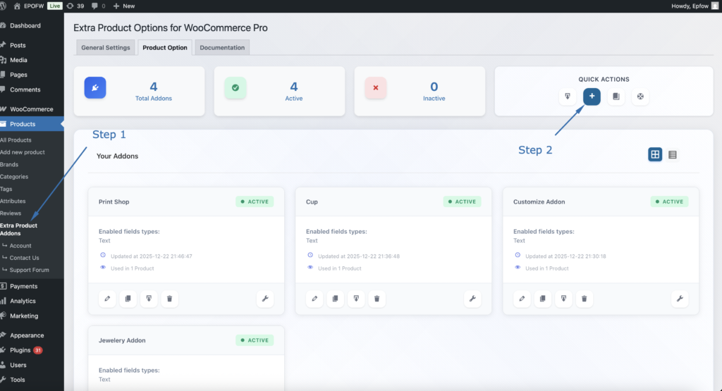
Step 1: Access the Field Builder
- In your WordPress admin, go to WooCommerce > Products > Extra Product Addons
- Click “Add Product Addon” or edit an existing addon
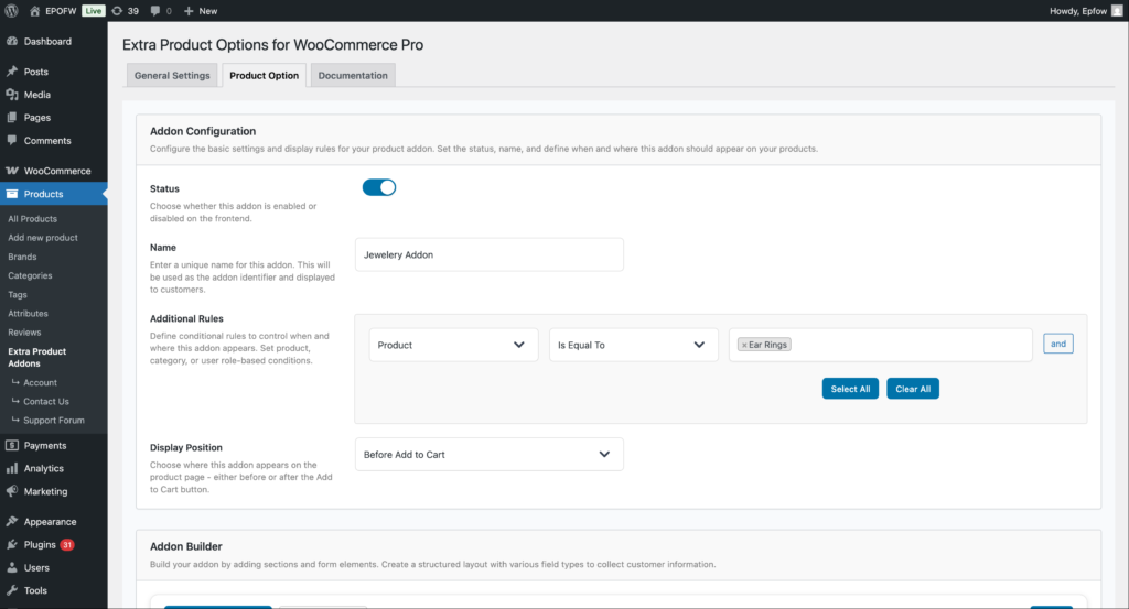
Addon Configuration:
- Status:
- Check the Status checkbox to enable the addon
- Unchecked addons are disabled and won’t appear on product pages
- Enable this to make your fields active
- Name:
- Enter a name for your addon (e.g., “Software Features”)
- This name helps you identify the addon in the admin area
- It’s not visible to customers on the frontend
- Additional Rules:
- Configure which products should display this addon
- Product: Select the condition type (Product, Category, Tag, etc.)
- Is Equal To: Choose the comparison operator
- Value: Select specific products, categories, or other criteria
- Use “Select All” or “Clear All” for bulk selection
- Click “and” to add multiple conditions
- Example: Apply to “Product” “Is Equal To” “Silver Ring” to show only on that product
- Display Position:
- Select where the addon fields appear on the product page
- Options include:
- Before Add to Cart (most common)
- After Add to Cart
- Choose the position that works best with your theme layout
Product addons help you organize your extra product options and apply them consistently across your store. Think of them as containers that hold multiple fields for specific products or product types.
Step 2: Add the Checkbox Field
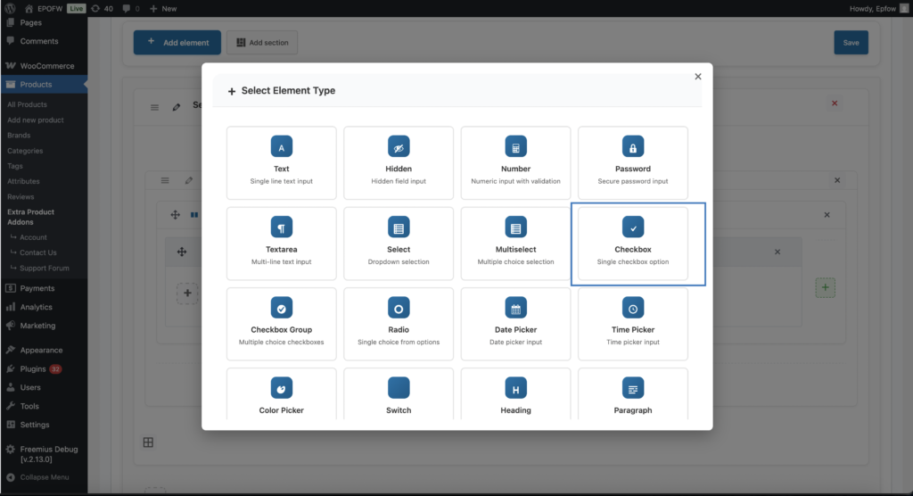
- In your Addon Builder, click “Add Element/Add Section -> ( + ) Add Element” button
- Select Checkbox from Select Element Type modal popup
Step 3: Configure General Settings
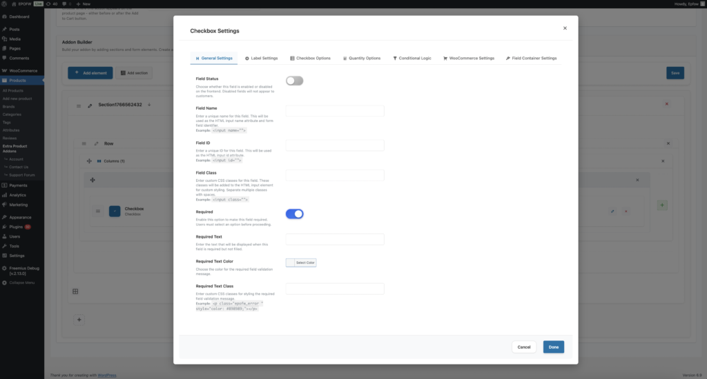
The General Settings tab contains basic field configuration options that control the field’s core functionality and behavior.
The field title is crucial because it’s the first thing customers see. Make it clear and specific to avoid confusion during checkout.
General Settings:
- Field Status:
- What it does
- Controls whether the field is enabled or disabled on the frontend.
- How to use:
- Enabled (ON): The field will be displayed to customers on the product page
- Disabled (OFF): The field will be hidden from customers but remains in your configuration
- Best practices:
- Keep fields enabled during testing to see how they appear to customers
- Disable fields temporarily if you need to make changes without affecting live products
- Use this setting to A/B test different field configurations
- What it does
- Field Name:
- What it does:
- Sets the HTML name attribute for the checkbox field. This is used for form submission and data processing.
- How to use:
- Enter a unique name for the field (e.g., `product_addons`, `service_upgrades`, `warranty_options`)
- The name will be automatically prefixed with `epofw_field_` if not already present
- Use descriptive names that indicate the field’s purpose
- Example:
- Field Name:
product_addons - HTML Output:
`<input type="checkbox" name="epofw_field_product_addons[value][]">`
- Field Name:
- Technical Details:
- Must be unique within the addon
- The
[]in the name indicates it accepts multiple values - Used in form data processing and cart item meta
- What it does:
- Field ID:
- What it does:
- Sets the HTML id attribute for the checkbox field. Used for CSS styling and JavaScript targeting.
- How to use:
- Enter a unique ID for the field
- The ID will be automatically prefixed with
epofw_field_if not already present - Use descriptive IDs that match your naming conventions
- Example:
- Field ID:
product_addons - HTML Output:
<input type="checkbox" id="epofw_field_product_addons_..." />
- Field ID:
- Best practices:
- Keep IDs consistent with field names for easier maintenance
- Use kebab-case or snake_case for multi-word IDs
- Ensure IDs are unique across all fields on the page
- What it does:
- Field Class:
- What it does:
- Adds custom CSS classes to the checkbox field for styling purposes.
- How to use:
- Enter one or more CSS classes separated by spaces
- These classes will be added to the
<select>element - Use classes that match your theme’s styling conventions
- Example:
- Field Class:
custom-checkbox premium-addon - HTML Output:
<input type="checkbox" class="custom-checkbox premium-addon" />
- Field Class:
- Best practices:
- Use semantic class names that describe the field’s purpose or style
- Follow your theme’s CSS naming conventions
- Test classes to ensure they don’t conflict with existing styles
- What it does:
- Required:
- The Required setting determines whether customers must fill out the checkbox field before they can add the product to their cart. When enabled, the field becomes mandatory and validation will prevent submission if the field is empty.
- Field Options (Premium):
- Text: Enter custom validation message that appears when the field is empty (e.g., “Please select at least one add-on to continue”)
- Color For Required Text: Choose the color for the validation message (typically red or orange for errors)
- Required Text Class: Add custom CSS classes to the validation message for additional styling
- Only mark fields as required when the information is truly necessary for order fulfillment. Too many required fields can frustrate customers and reduce conversion rates.
Step 4: Configure Label Settings
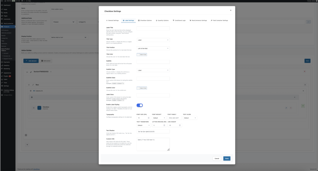
The Label Settings tab controls how the field label (title and subtitle) appears to customers. These settings help you create clear, professional field labels that guide customers effectively.
Label Settings
- Label Title:
- What it does:
- Sets the main label text displayed with the checkbox field on the frontend.
- How to use:
- Enter descriptive text that clearly explains what the field is for
- Keep labels concise but informative
- Use language that matches your product descriptions
- Examples of Effective Titles:
- Label Title: “Select Product Add-Ons”
- Label Title: “Choose Service Upgrades”
- Label Title: “Pick Warranty Options”
- Best practices:
- Use action words like “Select”, “Choose”, or “Pick” to guide customers
- Make labels specific to avoid confusion
- Match the tone and style of your product descriptions
- What it does:
- Title Type (Premium)
- What it does:
- Determines the HTML element used for the label title (label, h1-h6, span, div, p).
- How to use:
- Label: Standard label element (recommended for most cases)
- Heading (h1-h6): Use for prominent labels that need heading semantics
- Span/Div/P: Use for inline or block-level labels with custom styling
- Best practices:
- Use “label” for standard form fields (most common)
- Use heading elements only if the label serves as a section heading
- Consider SEO implications when choosing heading elements
- What it does:
- Title Position (Premium)
- What it does:
- Controls where the label appears relative to the checkbox field.
- How to use:
- Left: Label appears to the left of the field (default)
- Right: Label appears to the right of the field
- Top: Label appears above the field
- Bottom: Label appears below the field
- Best practices:
- Use “Top” for better mobile responsiveness
- Use “Left” for compact desktop layouts
- Test different positions to see what works best for your design
- What it does:
- Title Color (Premium)
- What it does:
- Sets the text color of the label title.
- How to use:
- Choose a color that matches your theme’s typography
- Ensure sufficient contrast for readability (WCAG AA compliance)
- Use colors that guide attention without being distracting
- Best practices:
- Test color choices on different backgrounds
- Consider dark mode compatibility if your theme supports it
- Maintain consistency across all field labels
- What it does:
- Subtitle
- What it does:
- Adds additional descriptive text below the main label to provide more context.
- How to use:
- Enter helpful information that clarifies the field’s purpose
- Use subtitles to explain pricing, features, or important details
- Keep subtitles concise to avoid overwhelming customers
- Example:
- Subtitle: “Select multiple add-ons to customize your purchase”
- Subtitle: “Each selected option adds to the total price”
- Subtitle: “You can select as many options as needed”
- Best practices:
- Use subtitles to highlight value propositions
- Include pricing information when relevant
- Keep text short and scannable
- What it does:
- Subtitle Type (Premium)
- What it does:
- Determines the HTML element used for the subtitle (label, h1-h6, span, div, p).
- How to use:
- Label: Standard label element (recommended)
- Heading (h1-h6): Rarely used for subtitles
- Span/Div/P: Use for inline or block-level subtitles
- Best practices:
- Use “label” or “p” for most subtitles
- Match the subtitle type to your theme’s styling
- Ensure proper semantic HTML structure
- What it does:
- Subtitle Class
- What it does:
- Adds custom CSS classes to the subtitle for styling.
- How to use:
- Enter CSS classes separated by spaces
- Use classes that match your theme’s styling
- Test to ensure proper display
- What it does:
- Subtitle Color (Premium)
- What it does:
- Sets the text color of the subtitle.
- How to use:
- Choose a color that’s slightly muted compared to the main label
- Ensure readability while maintaining visual hierarchy
- Match your theme’s secondary text color
- What it does:
- Label Class
- What it does:
- Adds custom CSS classes to the entire label container.
- How to use:
- Enter CSS classes for styling the label wrapper
- Use classes that match your theme’s form styling
- Apply classes that affect both title and subtitle
- What it does:
- Enable Label Styling (Premium)
- What it does:
- Provides advanced typography and styling options for the label.
- Available Options:
- Font Size: Set the label text size in pixels
- Font Weight: Control text boldness (100-900)
- Font Family: Specify custom font families
- Text Align: Control text alignment (left, center, right, justify)
- Text Transform: Control text case (uppercase, lowercase, capitalize, none)
- Letter Spacing: Adjust spacing between characters
- Line Height: Control line spacing for multi-line labels
- Text Shadow: Add text shadow effects
- Custom CSS: Add advanced custom styles
- How to use:
- Enable “Enable Label Styling” to access these options
- Configure typography settings to match your brand
- Use custom CSS for advanced styling needs
- Best practices:
- Maintain readability with appropriate font sizes
- Use consistent typography across all fields
- Test on different devices and screen sizes
- What it does:
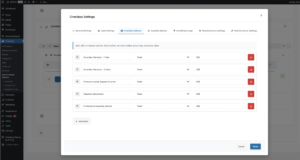
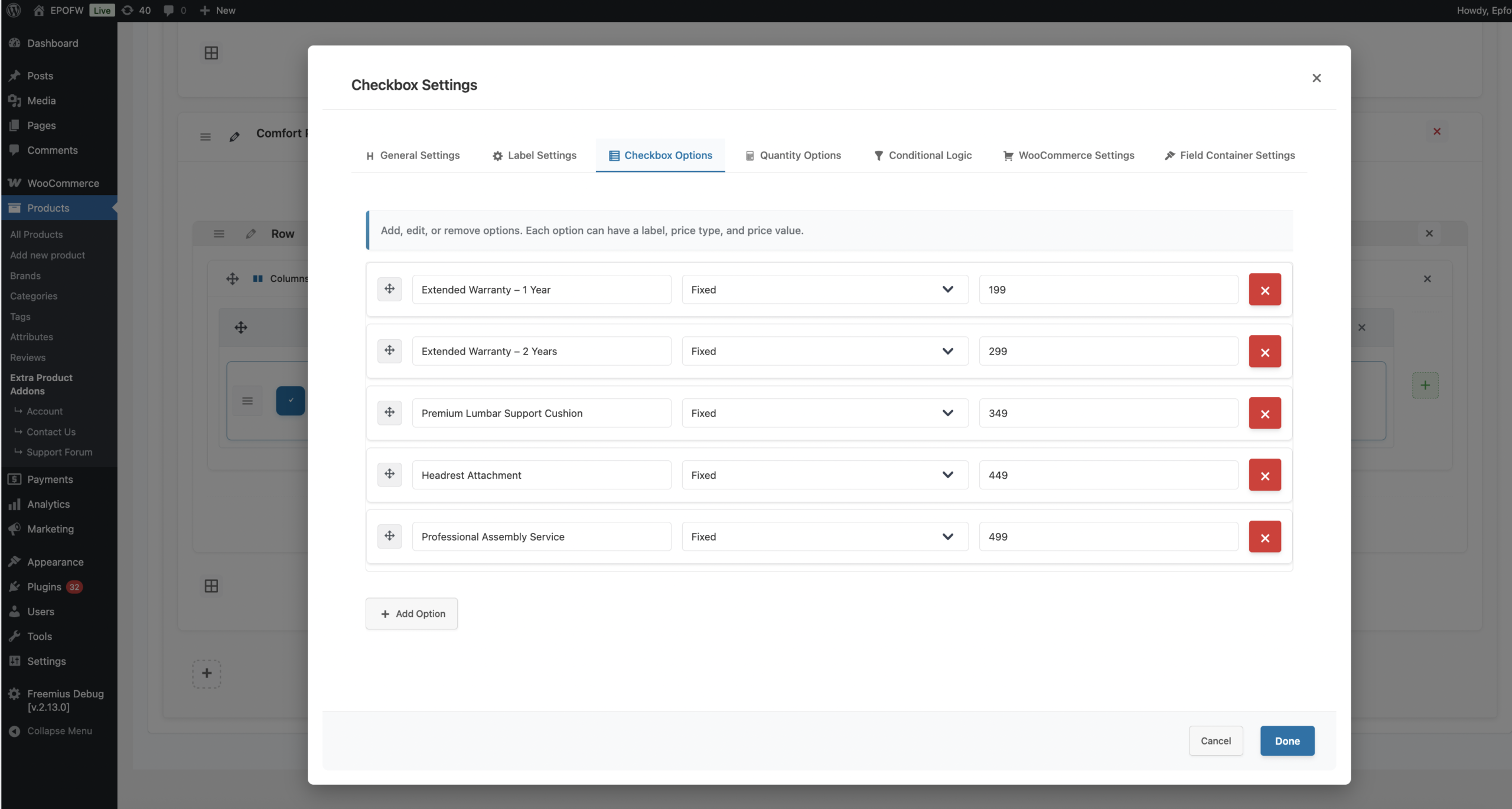
Step 5: Configure Checkbox Options
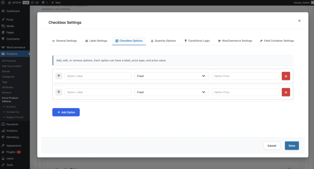
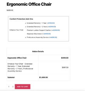
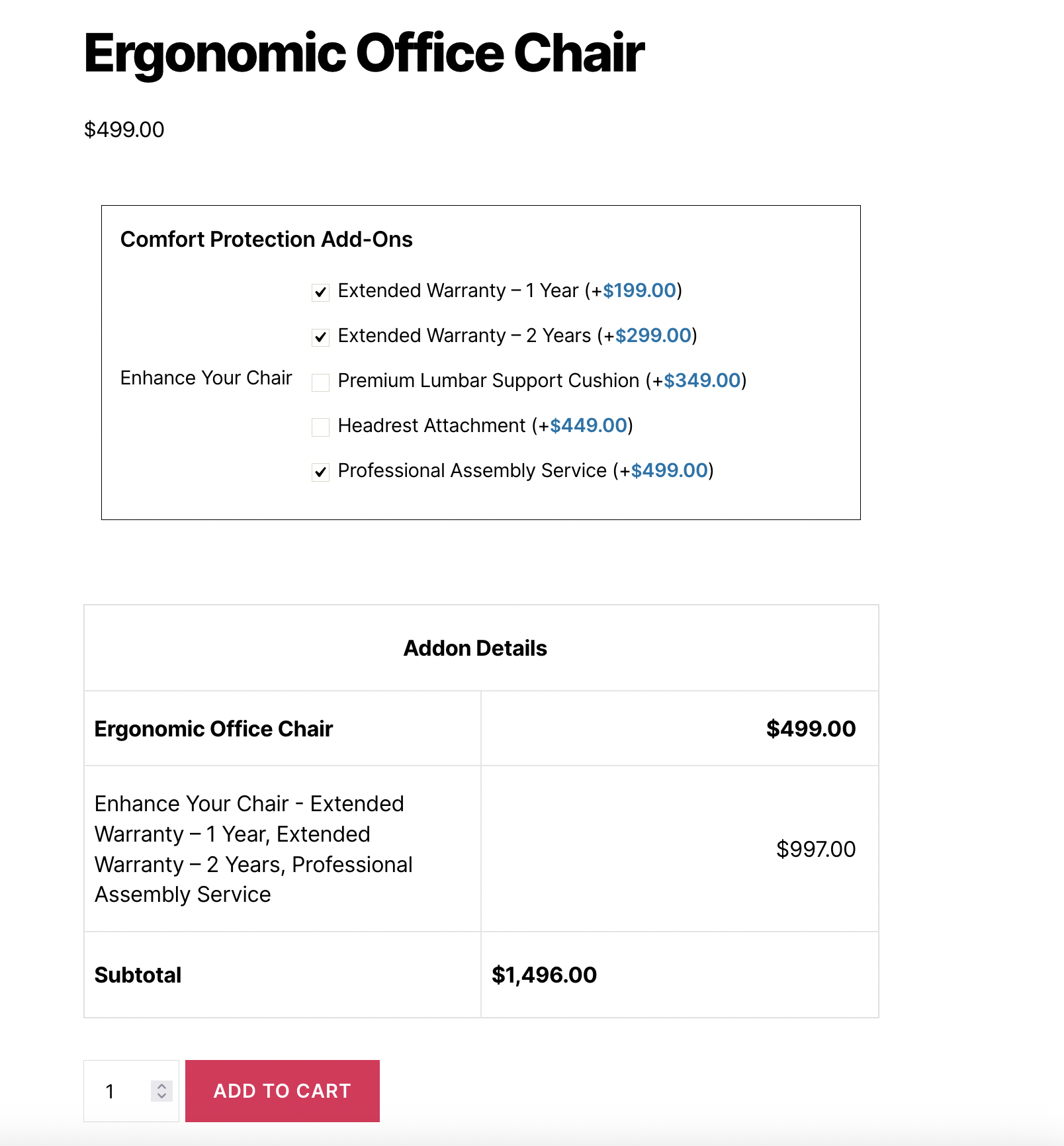
The Checkbox Field’s most important feature is its options configuration. Each checkbox option can have its own label and pricing, and customers can select multiple options independently.
Checkbox Options
- Adding Options
- How to use:
- Click **“Add Option”** button in the Options Settings tab
- 2. Enter the option label (what customers will see)
- 3. Select the price type for this option
- 4. Enter the price value
- 5. Repeat for all options you want to offer
- Example Options Setup:
- Product Add-Ons Example:
- Option 1: Label: “Extended Warranty”, Price Type: Fixed, Price: $25
- Option 2: Label: “Premium Support”, Price Type: Fixed, Price: $15
- Option 3: Label: “Gift Wrapping”, Price Type: Fixed, Price: $8
- Service Upgrades Example:
- Option 1: Label: “Insurance Coverage”, Price Type: Percentage, Price: 3
- Option 2: Label: “Premium Support”, Price Type: Percentage, Price: 8
- Option 3: Label: “Priority Handling”, Price Type: Percentage, Price: 5
- Software Features Example:
- Option 1: Label: “Advanced Analytics”, Price Type: Fixed, Price: $29
- Option 2: Label: “API Access”, Price Type: Fixed, Price: $49
- Option 3: Label: “Priority Support”, Price Type: Fixed, Price: $19
- Product Add-Ons Example:
- Option Label
- What it does:
- The text that customers see next to each checkbox option.
- How to use:
- Enter clear, descriptive labels that customers will understand
- Include important information like pricing, features, or delivery times
- Keep labels concise to fit within the available space
- Best practices:
- Use consistent formatting across all options
- Include pricing information in the label when helpful
- Make labels scannable and easy to compare
- Example Labels:
- “Extended Warranty – $25”
- “Premium Support – $15”
- “Insurance Coverage – 3% of product price”
- What it does:
- Option Price Type : Each option can have its own price type, giving you maximum flexibility:
- Fixed Price
- What it does:
- Adds a fixed amount to the product price when this option is selected.
- How it works:
- Each option has a fixed price that gets added to the product when selected
- The price is added regardless of the base product price
- Perfect for options with set prices
- Example:
- Extended Warranty: Fixed price of $25
- Gift Wrapping: Fixed price of $8
- Express Shipping: Fixed price of $12
- When a customer selects “Extended Warranty” and “Gift Wrapping”, $33 ($25 + $8) will be added to the base price.
- Use cases:
- Product accessories with fixed prices
- Service add-ons with set rates
- Gift wrapping or special packaging
- Express shipping or processing
- What it does:
- Percentage of Product Price
- What it does:
- Adds a percentage of the product’s base price when this option is selected.
- How it works:
- Each option adds a percentage of the product’s base price
- The percentage is calculated from the current product price
- Perfect for options that scale with product value
- Example:
- Insurance Coverage: 3% of product price
- Premium Support: 8% of product price
- Priority Handling: 5% of product price
- For a $200 product, selecting “Insurance Coverage” and “Premium Support” adds $22 ($6 + $16) to the price.
- Use cases:
- Insurance coverage options
- Service packages that scale with product value
- Warranty extensions based on product price
- Support tiers as percentage of purchase
- What it does:
- Fixed Price
- Option Price
- What it does:
- The price value for the selected price type.
- How to use:
- For Fixed: Enter the dollar amount (e.g., 25 for $25)
- For Percentage: Enter the percentage value (e.g., 15 for 15%)
- Best practices:
- Use clear, round numbers when possible for better customer experience
- Test pricing calculations to ensure accuracy
- Display prices clearly in option labels when helpful
- What it does:
- How to use:
- Reordering Options
- How to use:
- Drag and drop options using the move icon (⋮⋮) to reorder them
- Place most popular or recommended options at the top
- Organize options logically (e.g., cheapest to most expensive)
- Best practices:
- Put the most popular option first for better conversion
- Group similar options together
- Consider placing premium options last to encourage upsells
- How to use:
- Removing Options
- How to use:
- Click the remove button (×) next to any option to delete it
- Removed options are immediately deleted from the configuration
- Changes are saved when you save the addon
- Best practices:
- Review options before removing to avoid data loss
- Consider disabling options instead of removing if you might need them later
- Test the field after removing options to ensure proper functionality
- How to use:
Real-World Pricing Examples
See how real businesses use the Checkbox Field in their WooCommerce stores:
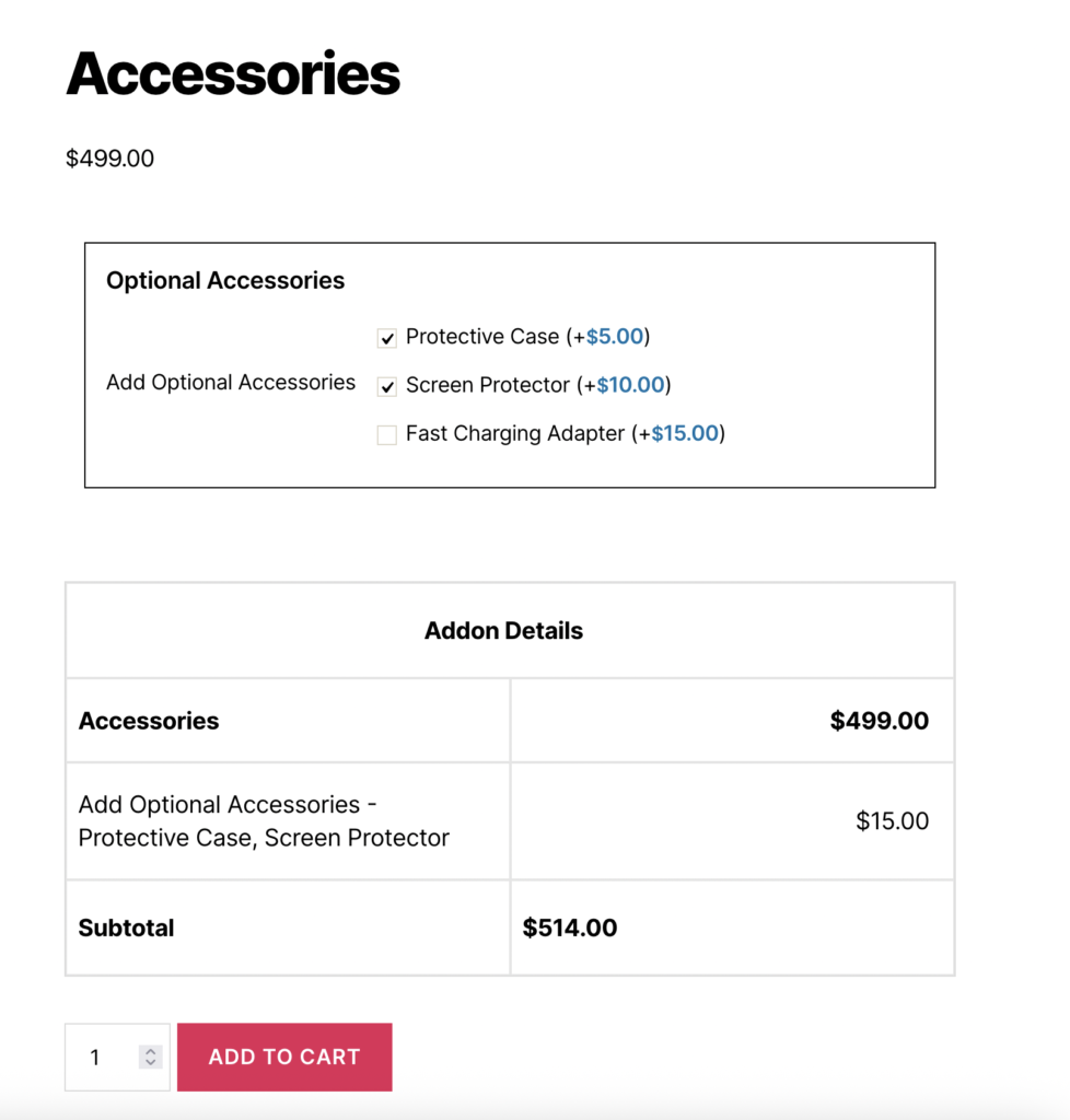
Product Add-Ons
Set up a Checkbox Field with:
- Field Type: Checkbox
- Options:
- Extended Warranty: Fixed price $25
- Premium Support: Fixed price $15
- Gift Wrapping: Fixed price $8
- Express Shipping: Fixed price $12
Result:
- Customers can select any combination they want
- Each selected option adds its price to the total
- Selecting “Extended Warranty”, “Gift Wrapping”, and “Express Shipping” adds $45 ($25 + $8 + $12) to the base price
Set up a Checkbox field with:
- Field Type: Checkbox
- Options:
- Advanced Analytics: Fixed price $29
- API Access: Fixed price $49
- Priority Support: Fixed price $19
- Custom Branding: Fixed price $39
Result:
- Perfect for SaaS products where customers can pick and choose additional features
- Each feature can be selected independently
- Prices accumulate for each selected feature
Software Features
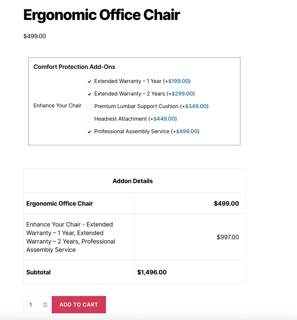
Service Upgrades with Percentage Pricing
Set up a Checkbox field with:
- Field Type: Checkbox
- Options:
- Insurance Coverage: 5% of product price
- White Glove Service: 15% of product price
- Expedited Processing: 8% of product price
Result:
- For a $300 product, selecting all three adds $84 ($15 + $45 + $24) to the price
- Pricing scales automatically with product price
- Service levels are included in order details
What Your Customers See
When a customer interacts with your Checkbox Field:
- Checkbox List: They’ll see a list of checkboxes with option labels and prices
- Independent Selection: They can select or deselect any combination of options independently
- Price Display: Each option displays its price next to the label
- Price Updates: The product price updates in real-time as options are selected/deselected
- Visual Feedback: Selected options are clearly marked with checkmarks
- Cart Integration: All selected options and their combined price are included in the cart
Frontend Display:
The Checkbox Field appears as a list of HTML `<input type=”checkbox”>` elements with:
- Each checkbox option displayed with its label and price
- Checkboxes can be selected independently
- Prices displayed next to each option (if enabled)
- Automatic price calculation when options are selected or deselected
- Clear visual indication of selected vs unselected options
Tips for Creating Effective Checkbox Fields
Creating an effective Checkbox Field involves balancing flexibility with control. Consider these best practices to ensure your Checkbox fields provide excellent user experience while collecting high-quality data.
- Option Configuration
- Clear Labels: Use descriptive, easy-to-understand option names that clearly communicate what each option includes
- Logical Ordering: Arrange options from least to most expensive, or most to least popular, to guide customer decisions
- Reasonable Pricing: Set prices that reflect the value of each option and are competitive in your market
- Consistent Formatting: Use consistent formatting across all options (e.g., always include pricing, always include delivery times)
- Manageable Count: While there’s no strict limit, keep options to 5-15 choices for best user experience
- Label and Display
- Descriptive Titles: Use clear, action-oriented labels like “Select Product Add-Ons” or “Choose Service Upgrades”
- Helpful Subtitles: Add subtitles to explain that multiple selections are allowed and how pricing works
- Visual Hierarchy: Use title colors and styling to create clear visual hierarchy
- Mobile Optimization: Test labels on mobile devices to ensure they’re readable and not cut off
- Pricing Strategy
- Transparent Pricing: Make pricing clear and easy to understand
- Value Communication: Use labels and subtitles to communicate the value of each option
- Strategic Positioning: Place premium options strategically to encourage upsells
- Test Pricing: A/B test different pricing structures to find what works best
- Bundle Discounts: Consider using custom formulas to offer discounts for multiple selections
- User Experience
- Required vs Optional: Only make fields required when at least one selection is critical
- Error Messages: Provide clear, helpful error messages for required fields
- Loading States: Ensure price updates happen smoothly without jarring transitions
- Visual Feedback: Selected checkboxes should be clearly visible with checkmarks
- Performance
- Option Count: While there’s no strict limit, keep options manageable (typically 5-15 options work best)
- Loading Speed: Test with many options to ensure page performance remains good
- Caching: Consider caching for fields with many options on high-traffic products
Advanced Features
- Conditional Logic
- What it does:
- Show or hide the Checkbox Field based on other field selections.
- How to use:
- Enable conditional logic for the Checkbox Field
- Set conditions based on other field values
- Configure when the field should be visible
- Example:
- Show “Product Add-Ons” field only when “Physical Product” is selected in another field
- Display “Service Upgrades” field only for service-based products
- Show “Warranty Options” field when customer selects “Premium Product” in another field
- Best practices:
- Use conditional logic to create dynamic, personalized experiences
- Test all condition combinations to ensure proper behavior
- Provide fallback options when fields are hidden
- What it does:
- WooCommerce Integration
- What it does:
- Integrates the Checkbox Field with WooCommerce features like cart, checkout, and order management.
- Features:
- Cart Display Control: You can hide addon details to keep the cart summary clean
- Price Visibility Control: It’s possible to show selected options without displaying their price
- Order Management Visibility: You can choose whether selected options appear in admin order records
- Addon Tax Settings: Apply tax calculations to addon prices
- Tax Rates: Select specific tax classes for addons
- Best practices:
- Ensure option labels are clear in order details
- Test email notifications to verify option display
- Use descriptive option names for better order management
- What it does:
Free vs Premium
Free Version Includes:
- Basic Checkbox Field functionality
- Multiple checkbox options configuration
- Fixed and Percentage pricing per option
- Field-level pricing (Fixed and Percentage)
- Basic label settings
- Required field validation
- Standard checkbox interface
Premium Version Adds:
- Advanced label styling (Typography, Colors, Custom CSS)
- Conditional logic
- Quantity settings
- WooCommerce integration settings
- Row and column layouts
- Field container styling
- Advanced validation options
Troubleshooting
Options Not Displaying
- Check that at least one option is configured in Options Settings
- Verify option labels are not empty
- Ensure the field is enabled (Field Status is ON)
- Clear cache if using caching plugins
- Check browser console for JavaScript errors
Prices Not Calculating
- Verify “Enable Pricing” is enabled in Pricing Settings
- Check that price values are entered correctly (numbers only, no currency symbols)
- Ensure price types are selected for each option
- Test with different price types to isolate the issue
- Check for JavaScript errors in browser console
- Verify that multiple selections are being processed correctly
Field Not Appearing on Frontend
- Verify Field Status is enabled (ON)
- Check that the addon is assigned to the product
- Ensure the addon status is “Published” or “Enabled”
- Verify product rules match (if conditional rules are set)
- Clear all caches (browser, plugin, server)
- Check for JavaScript conflicts with other plugins
Selected Option Not Saving
- Verify the field name is unique and valid
- Check that the field is not disabled
- Ensure form submission is working correctly
- Test with different browsers to rule out browser-specific issues
- Check WooCommerce order meta to see if data is being saved
- Verify the checkbox inputs have proper name attributes
Price Calculation Errors
- Verify each option’s price type and value are correct
- Check that percentage calculations are working (test with known values)
- Ensure custom formulas (if used) are syntactically correct
- Test with different combinations of selections
- Verify field-level pricing (if enabled) is being added correctly
- Check for JavaScript errors in browser console
Frequently Asked Questions
Find answers to commonly asked questions about our products and services.
Still have a question?
If you have any other queries, feel free to reach out to us. Our knowledgeable team is here to help!
Conclusion
Checkbox Fields offer an excellent way to create flexible product configurations where customers can choose multiple add-ons independently. Each option can include its own price, percentage, or conditional rule, allowing businesses to build highly customizable product experiences. The ability to combine checkboxes with validation, pricing strategies, and conditional logic ensures accurate product setups and smooth ordering, helping increase average order value while improving customer control and convenience.
With WPActPro’s Extra Product Options for WooCommerce, creating dynamic, flexible, and professional checkbox-based customization options becomes effortless for your WooCommerce store. Whether you’re selling physical products, digital goods, or services, the Checkbox Field gives you the tools you need to offer independent optional choices with flexible pricing.