

Text Field
Add customizable text input fields to your WooCommerce products with WPActPro’s Text Field option. Allow customers to enter personalized names, messages, engravings, or any short text directly on your product pages.
What is the Text Field?
The Text Field allows customers to enter short text input directly on your WooCommerce product page. This field type is essential for any product that requires personalization – from engraved jewelry to custom printed t-shirts, monogrammed gifts to personalized signs.
Unlike the standard WooCommerce product fields, Extra Product Options for WooCommerce’s Text Field includes advanced features that give you complete control over customer input:
- Character Limits: Set minimum and maximum character counts (Premium feature)
- Validation Rules: Restrict input to letters only, numbers only, email addresses, URLs, or specific patterns
- Flexible Pricing: Control field behavior, appearance, and validation through comprehensive settings
- Real-Time Feedback: Show validation messages and guide customers through the input process
Whether you’re selling personalized jewelry, custom apparel, or any product that needs text customization, the Text Field provides everything you need to collect customer input effectively.
The Text Field is one of the most versatile options in the Extra Product Options for WooCommerce plugin suite. It bridges the gap between standard product options and fully customized orders, enabling store owners to offer personalized products without the complexity of custom development.
Why Use a Text Field?
Text fields serve multiple purposes in e-commerce, making them essential for various business models:
- Customization: Allows customers to personalize their orders with custom text, creating unique products that stand out from standard inventory
- Information Collection: Gather specific details like names, messages, or instructions that are necessary for order fulfillment
- User-Friendly: Simple and familiar input method that customers understand immediately – no learning curve required
- Validation: Can be restricted to specific formats (email, URL, numbers, etc.) ensuring data quality and reducing errors
- Flexible Integration: Works seamlessly with other field types and can be combined with conditional logic for dynamic forms
Common Use Cases:
Custom names or initials: Perfect for personalized products like gifts, apparel, and accessories where customers want to add their own name or initials. This is especially popular for jewelry, clothing, and keepsake items where personalization adds significant value.
Engraving instructions: Allow customers to specify what they want engraved on jewelry, plaques, trophies, or custom metal/wood items. Clear instructions help ensure the final product matches customer expectations exactly.
Short messages: Ideal for greeting cards, gift boxes, personalized notes, or any product requiring short custom text. Text fields are perfect when you need brief messages that fit within character limits.
Personal notes: This is useful for customers who want to add a private message, dedication, or custom request during their purchase. These notes can be included with orders or used for internal processing.
Product detail customization: Let customers enter custom values, labels, identifiers, or any text-based detail needed to tailor the product. This is common for custom manufacturing or personalized products.
Gift messages: Enable customers to include a heartfelt message when purchasing items as gifts. This adds emotional value and makes the purchase more meaningful.
Order instructions: Provide a space for special requests, handling instructions, or customization notes related to the order. This helps ensure orders are processed correctly and meet customer expectations.

WPActPro makes it easy to collect text input and control how it impacts pricing, validation, and the final order..
- For numeric input such as quantities or measurements, try our Number Field
- When you want customers to choose a single option, use our Select Field
- For situations where multiple selections are needed, the Multiselect Field is the best choice.
- To offer simple yes/no or on/off choices, use our Checkbox Field
- And when paragraph-style input is required, try our Textarea Field
When to Use the Text Field
The Text Field is perfect for these product types:
Personalized Jewelry
Text fields are essential for jewelry stores offering engraving services. Customers can specify exactly what they want engraved on rings, bracelets, necklaces, lockets, pendants, and other jewelry pieces.
- Engraving on rings, bracelets, necklaces
- Custom messages on lockets
- Monogram initials on pendants
- Date inscriptions on anniversary pieces
Jewelry stores benefit from text fields because personalization significantly increases the perceived value of products. Customers are willing to pay premium prices for items that carry personal meaning, and text fields make it easy to collect this information during the purchase process.
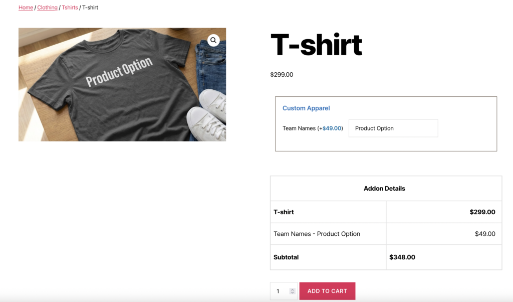
Custom Apparel
Apparel businesses use text fields to offer customization that differentiates their products from mass-produced alternatives. This is especially valuable for sports teams, corporate events, and special occasions.
- Names on sports jerseys
- Custom text on t-shirts
- Personalized embroidery on hats
- Team names on uniforms
Text fields allow customers to specify exactly what text they want printed or embroidered, ensuring accuracy and reducing the need for follow-up communication.
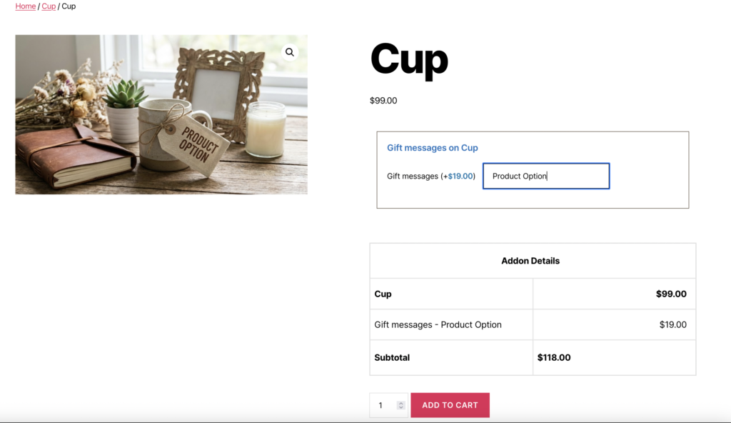
Gifts & Keepsakes
Gift shops and specialty retailers use text fields to add emotional value to their products. A simple photo frame becomes a meaningful gift when it includes a personalized message.
- Gift messages on cards
- Names on photo frames
- Dedication text on awards/trophies
- Custom inscriptions on plaques
Text fields make it easy for customers to add personal touches that transform standard products into meaningful gifts.
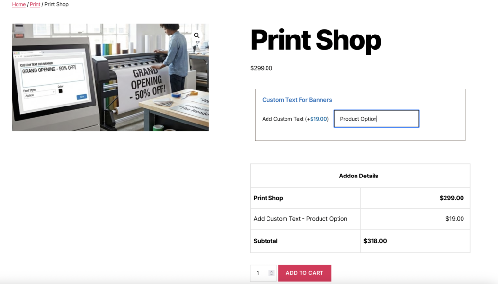
Signs & Prints
Print shops and sign makers rely on text fields to collect customer specifications efficiently. This eliminates the need for separate quote requests and streamlines the ordering process.
- Custom text for banners
- Personalized door signs
- Name plates and labels
- Business signage
Text fields allow customers to enter their desired text directly during checkout, making the ordering process faster and more efficient.
How to Set Up the Text Field
Follow these comprehensive step-by-step instructions to add a Text Field to your WooCommerce products. This guide covers all essential settings organized into General Settings, Label Settings, and Text Options.
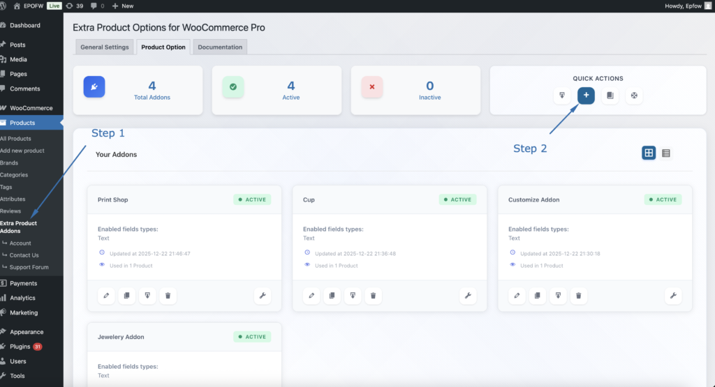
Step 1: Create a New Option Group
- In your WordPress admin, go to WooCommerce > Products > Extra Product Addons
- Click “Add Product Addon” or edit an existing addon
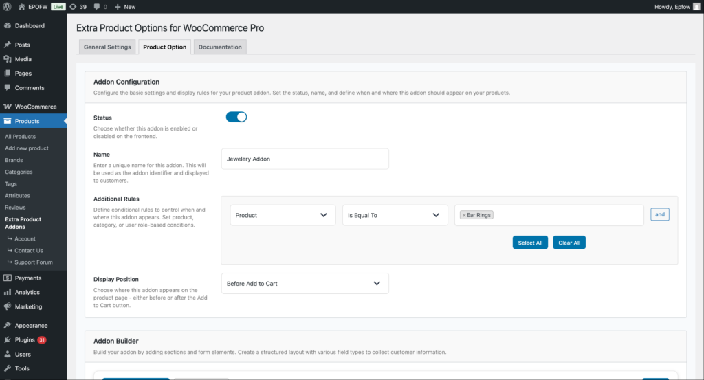
Addon Configuration:
- Status:
- Check the Status checkbox to enable the addon
- Unchecked addons are disabled and won’t appear on product pages
- Enable this to make your fields active
- Name:
- Enter a name for your addon (e.g., “Personalization Options”)
- This name helps you identify the addon in the admin area
- It’s not visible to customers on the frontend
- Additional Rules:
- Configure which products should display this addon
- Product: Select the condition type (Product, Category, Tag, etc.)
- Is Equal To: Choose the comparison operator
- Value: Select specific products, categories, or other criteria
- Use “Select All” or “Clear All” for bulk selection
- Click “and” to add multiple conditions
- Example: Apply to “Product” “Is Equal To” “Silver Ring” to show only on that product
- Display Position:
- Select where the addon fields appear on the product page
- Options include:
- Before Add to Cart (most common)
- After Add to Cart
- Choose the position that works best with your theme layout
Product addons help you organize your extra product options and apply them consistently across your store. Think of them as containers that hold multiple fields for specific products or product types.
Step 2: Add the Text Field
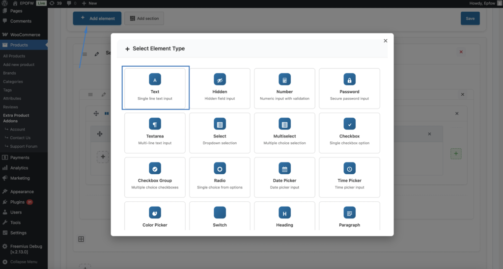
- In your Addon Builder, click “Add Element/Add Section -> ( + ) Add Element” button
- Select Text from Select Element Type modal popup
Step 3: Configure General Settings
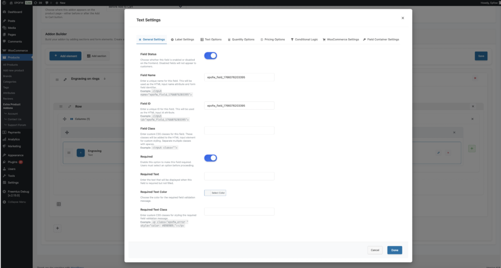
The General Settings tab contains basic field configuration options that control the field’s core functionality and behavior.
The field title is crucial because it’s the first thing customers see. Make it clear and specific to avoid confusion during checkout.
General Settings:
- Field Status:
- The Field Status toggle determines whether the text field will be visible and functional for customers on the frontend product page. This is the master switch that controls field visibility.
- Field Name:
- The Field Name setting allows you to set a unique HTML name attribute for the text field. This name is used as the HTML name attribute on the input element and serves as the form field identifier when the form is submitted. The field name is essential for form processing, data collection, and identifying which field the submitted data belongs to.
- By default, the plugin generates a unique field name automatically based on the field type and a unique identifier. This ensures that every field has a unique name without any manual configuration required. The auto-generated name typically follows a pattern like
epofw_field_1234567890where the number is a unique timestamp-based identifier. - The field name is used in the HTML output as:
<input type="text" name="your_field_name" id="...">. When the form is submitted, the data is sent as your_field_name=entered_text. This name is also used internally by the plugin for field identification, validation, and data processing. The field name must be unique within the form to prevent conflicts and ensure proper data handling.
- Field ID:
- The Field ID is a unique HTML identifier for the text field. This ID is used in the HTML
idattribute and can be referenced in CSS or JavaScript for custom styling and functionality. - The plugin automatically generates a unique ID (e.g.,
epofw_field_1234567890) - You can customize this ID to match your naming conventions
- Ensure the ID is unique and follows HTML naming rules (letters, numbers, hyphens, underscores)
- The Field ID appears in the HTML as:
<input type="text" id="your_field_id" name="...">. This allows you to target the field with CSS selectors like#your_field_idor JavaScript like `document.getElementById(your_field_id').
- The Field ID is a unique HTML identifier for the text field. This ID is used in the HTML
- Field Class:
- The Field Class setting allows you to add custom CSS classes to the text field input element. These classes can be used for styling, JavaScript targeting, or integration with third-party tools.
- Enter one or more CSS class names separated by spaces
- Use descriptive class names that indicate their purpose (e.g.,
custom-text-field,personalization-input) - Classes can be shared across multiple fields for consistent styling
- Adding the class
personalization-fieldallows you to style all personalization fields consistently with CSS like.personalization-field { border: 2px solid #0073aa; }.
- Required:
- The Required setting determines whether customers must fill out the text field before they can add the product to their cart. When enabled, the field becomes mandatory and validation will prevent submission if the field is empty.
- Field Options (Premium):
- Text: Enter custom validation message that appears when the field is empty (e.g., “Please enter your personalization text”)
- Color For Required Text: Choose the color for the validation message (typically red or orange for errors)
- Required Text Class: Add custom CSS classes to the validation message for additional styling
- Only mark fields as required when the information is truly necessary for order fulfillment. Too many required fields can frustrate customers and reduce conversion rates.
Step 4: Configure Label Settings
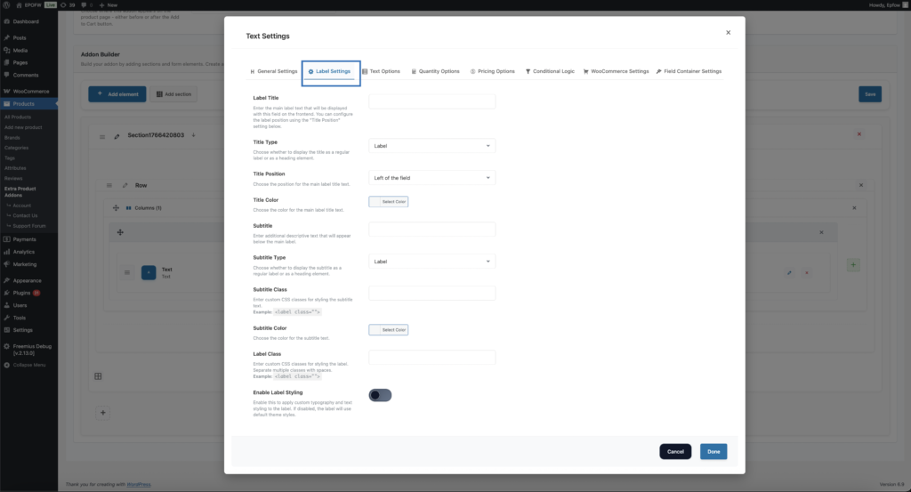
The Label Settings tab controls how the field label (title and subtitle) appears to customers. These settings help you create clear, professional field labels that guide customers effectively.
Label Settings
- Label Title:
- The Label Title is the main text that appears next to or above the text field. This is the primary identifier that tells customers what information they should enter.
- Examples of Effective Titles:
- Engraving Text – Clear for jewelry personalization
- Personalization Message – Descriptive for custom text
- Gift Message – Specific and action-oriented
- Special Instructions – Clear purpose
- The label title is required and is one of the most important elements for user experience. Make it immediately clear what information is expected.
- Title Type (Premium)
- Determines which HTML element is used to render the label title, affecting semantic structure and default styling.
- Available Options:
- Label (Default): Standard HTML `<label>` element – semantically correct for form fields
- H1-H6: Heading elements for semantic hierarchy
- Span: Generic inline element for purely visual styling
- Use “Label” for most text fields as it’s semantically correct and provides proper accessibility support.
- Title Position (Premium)
- Controls where the label title appears relative to the text input field.
- Available Options:
- Left: Label appears to the left of the input (common for desktop forms)
- Right: Label appears to the right of the input
- Top: Label appears above the input (preferred for mobile-responsive designs)
- Bottom: Label appears below the input
- Use “Top” position for mobile-responsive designs, “Left” for desktop forms with adequate horizontal space.
- Title Color (Premium)
- Customizes the text color of the label title to match your brand or create visual distinction.
- Use the color picker to select a color
- Enter hex codes for precise color matching
- Ensure sufficient contrast with background for accessibility (minimum 4.5:1 ratio)
- Subtitle
- The Subtitle field allows you to add additional descriptive text that appears below the main label title. This provides extra context, instructions, or examples.
- Enter helpful text that clarifies the field’s purpose
- Provide format examples or instructions
- Keep subtitles concise – typically one sentence
- Only add subtitles when they provide value
- Examples:
- Enter the text exactly as you want it to appear
- Maximum 50 characters
- Subtitle Type (Premium)
- Determines which HTML element is used to render the subtitle text.
- Available Options: Label (default), H1-H6, Span
- Subtitle Class
- Allows you to add custom CSS classes to the subtitle element for additional styling.
- Subtitle Color (Premium)
- Customizes the text color of the subtitle to create visual hierarchy.
- Label Class
- Add custom CSS classes to the label container element for styling the entire label area.
- Enable Label Styling (Premium)
- Activates advanced typography and styling options for the label, including font size, weight, family, text alignment, text transform, letter spacing, line height, text shadow, and custom CSS.
- When enabled, you can customize:
- Font Size: Control label text size in pixels
- Weight Of Font: Choose from 100 (thin) to 900 (black)
- Font Family: Specify custom font families
- Text Align: Left, center, right, justify, or default
- Text Transform: Uppercase, lowercase, capitalize, or none
- Letter Spacing: Control spacing between characters
- Line Height: Adjust vertical spacing between lines
- Text Shadow: Add shadow effects to text
- Custom CSS: Add advanced styling with custom CSS code
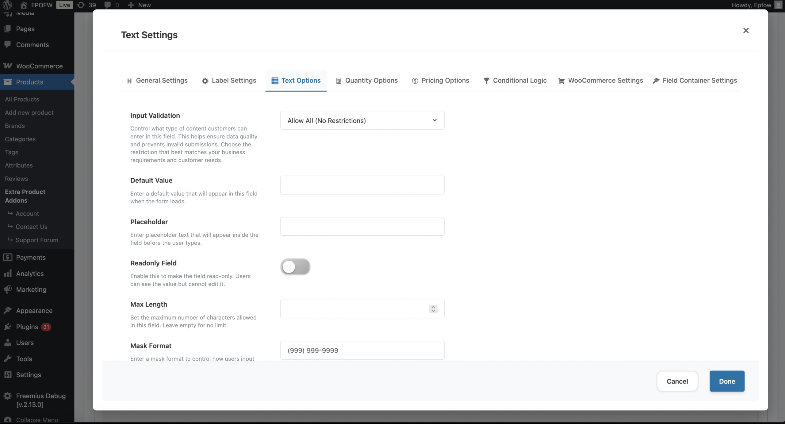
Step 5: Configure Text Options
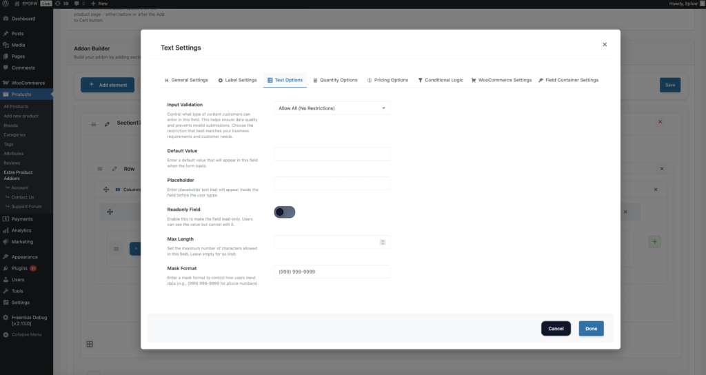
The Text Options tab contains settings specific to text input fields, including validation, default values, placeholders, and input restrictions.
Text Options
- Input Validation (Field Restriction):
- The Input Validation setting controls what type of content customers can enter in the text field. This helps ensure data quality, prevents invalid submissions, and guides customers to enter the correct type of information.
- Available Options:
- Allow All (No Restrictions): Customers can enter any combination of letters, numbers, and special characters. This is the default option and provides maximum flexibility. Use this when you need to accept varied content without restrictions.
- Text Only (No Numbers): Restricts input to letters and spaces only. Numbers and special characters are not allowed. Use this for name fields or when you need to prevent numeric input.
- Numbers Only (No Text): Restricts input to whole numbers only. Letters and special characters are not allowed. Use this for quantity fields, numeric identifiers, or when you need pure numeric input.
- Numbers with Decimals: Allows numeric input including decimal points. Useful for prices, measurements, or any decimal values. Use this for fields requiring decimal numbers like weights, dimensions, or prices.
- Text and Numbers: Allows both letters and numbers but restricts special characters. Useful for alphanumeric codes, product codes, SKUs, or identifiers that need both text and numbers but no special characters.
- Email Address Only: Validates that the input is a properly formatted email address. The plugin checks for the standard email format (text@domain.com). Use this for email collection fields, newsletter signups, or contact information forms.
- URL/Website Only (Premium): Validates that the input is a properly formatted website URL. Ensures the URL follows standard format requirements. Use this for website URL collection, social media profile links, or any field requiring valid URL format.
- Choose validation that matches your actual data requirements. Test validation on different browsers to ensure it works correctly. Provide clear labels and placeholders that indicate the expected format.
- Default Value
- The Default Value setting allows you to pre-fill the text field with a specific value when the form loads. This value appears in the field before the customer types anything, and they can either keep it, modify it, or delete it entirely.
- Enter the exact text you want to appear in the field by default
- Use defaults to provide examples, show format, or pre-fill common values
- Defaults are editable – customers can change or delete them
- Placeholder
- The Placeholder setting allows you to add hint text that appears inside the text field when it’s empty. This text disappears when the customer starts typing and reappears if they clear the field. Placeholders provide guidance without pre-filling the field with actual values.
- Enter hint text that guides customers (e.g., “Enter your name”, “e.g., John Smith”)
- Provide format examples or brief instructions
- Keep placeholders short and concise
- Examples of Effective Placeholders:
- Enter your full name” – Clear instruction
- “e.g., John Smith” – Format example
- “Maximum 50 characters” – Constraint information
- “Enter personalization text here” – Purpose clarification
- Keep placeholders short and concise. Use clear, simple language. Provide format examples when helpful. Don’t use placeholders as the only source of important information (they disappear when typing).
- Readonly Field
- The Readonly Field setting makes the text field display-only, meaning customers can see the value but cannot edit it. The field appears normal but is non-interactive, and the value cannot be changed by customers on the frontend.
- Enabled (ON): Check the box to make the field read-only. Customers can see the field and its value, but cannot edit it.
- Disabled (OFF): Leave unchecked for normal editable fields.
- Use readonly fields when you need to display but not allow editing. Make it visually clear that the field is read-only (may require custom CSS). Consider using readonly for calculated or system-generated values.
- Max Length (Premium)
- The Max Length setting limits the maximum number of characters customers can enter in the text field. This prevents overly long input and helps ensure data fits within your system’s constraints or business requirements.
- Enter the maximum number of characters allowed (e.g., 50, 100, 200)
- Consider typical input lengths for your use case
- The plugin enforces this limit through HTML5 `maxlength` attribute and JavaScript validation
- Set realistic limits based on actual data requirements. Consider typical input lengths for your use case. Test that limits work correctly across different browsers. Provide clear guidance about character limits in labels or placeholders.
- Field Restrictions
- Field restrictions help ensure inputs remain valid and consistent. The Input Validation setting (covered in Text Options above) allows you to control what type of content can be entered. You can limit input to specific formats, set character limits (Premium), or restrict input to letters, numbers, or specific patterns.
- Defining allowed characters prevents errors and maintains data quality, helping customers receive clear guidance while submitting correct and usable information. The plugin implements both HTML5 validation attributes and JavaScript validation to enforce these restrictions across different browsers and devices.
- Available Restriction Types:
- None (Allow All): No restrictions, accepts any text – maximum flexibility
- Email: Only valid email addresses – ensures proper email format
- URL (Premium): Only valid URLs – ensures proper website address format
- Number: Only numeric values – whole numbers only
- Numbers with Decimals: Numeric values including decimal points
- Text Only: Letters and spaces only, no numbers or special characters
- Text and Numbers: Alphanumeric input, no special characters
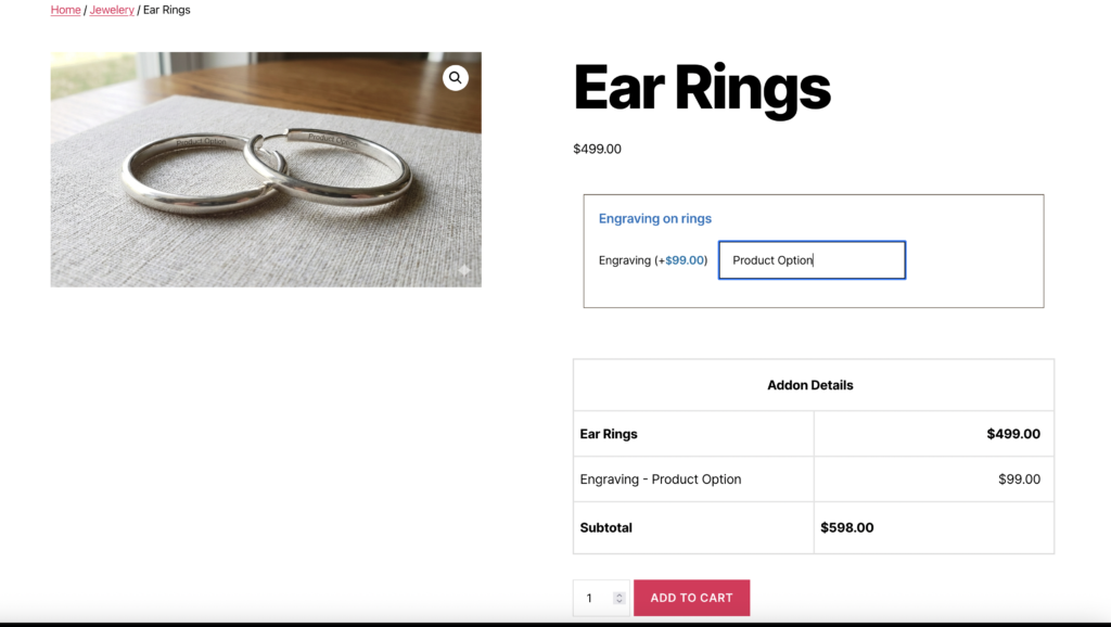
Real-World Pricing Examples
See how real businesses use the Text Field in their WooCommerce stores:
Custom Engraving with Price Per Character
Set up a text field with:
- Field Type: Text
- Price Type: Price Per Char
- Price: $0.20
When a customer enters “Happy Birthday Mom”, the price automatically adds $3.20 to the base product price (16 characters × $0.20).
Set up a text field with:
- Field Type: Text
- Formula: {ppw}*2+10
This means:
- $2 per word plus a $10 base fee
- “Roses are red” (3 words) = $16 added ($2 × 3 + $10)
- “Shall I compare thee to a summer’s day” (8 words) = $26 added ($2 × 8 + $10)
Custom Poetry with Base Fee + Word Count
Business Cards with Character-Based Pricing
Set up a text field with:
- Field Type: Text
- Price Type: Price Per Char(Ignore Space)
- Price: $0.15
This means:
- Each character costs $0.15 (spaces don’t count)
- “John Smith” (9 characters, 1 space) = $1.35 added
- “Marketing Director” (16 characters, 1 space) = $2.25 added
Set up a text field with:
- Field Type: Text
- Formula: {ppc}<=10?{ppc}*0.5:{ppc}*0.3
This means:
- First 10 characters: $0.50 each
- Additional characters: $0.30 each
- “Hello” (5 characters) = $2.50 added ($0.50 × 5)
- “Welcome to our store” (19 characters) = $7.70 added ($0.50 × 10 + $0.30 × 9)
Custom T-Shirt Text with Volume Discount
Wedding Invitations with Premium Pricing
Set up a text field with:
- Field Type: Text
- Formula: {ppw}*5+15
This means:
- $5 per word plus a $15 premium fee
- “You are cordially invited” (4 words) = $35 added ($5 × 4 + $15)
- “Please join us for our special day” (7 words) = $50 added ($5 × 7 + $15)
Set up a text field with:
- Field Type: Text
- Formula: {ppc}*0.25+5
This means:
- $0.25 per character plus a $5 setup fee
- “JS” (2 characters) = $5.50 added ($0.25 × 2 + $5)
- “JMS” (3 characters) = $5.75 added ($0.25 × 3 + $5)
Custom Monograms with Fixed + Character Pricing
Professional Headlines with Word Count Tiers
Set up a text field with:
- Field Type: Text
- Formula: {ppw}<=5?{ppw}*3:{ppw}<=10?{ppw}*2.5:{ppw}*2
This means:
- 1-5 words: $3 per word
- 6-10 words: $2.50 per word
- 11+ words: $2 per word
- “Professional” (1 word) = $3 added
- “Experienced marketing professional” (3 words) = $9 added
- “Senior marketing director with ten years experience” (7 words) = $17.50 added
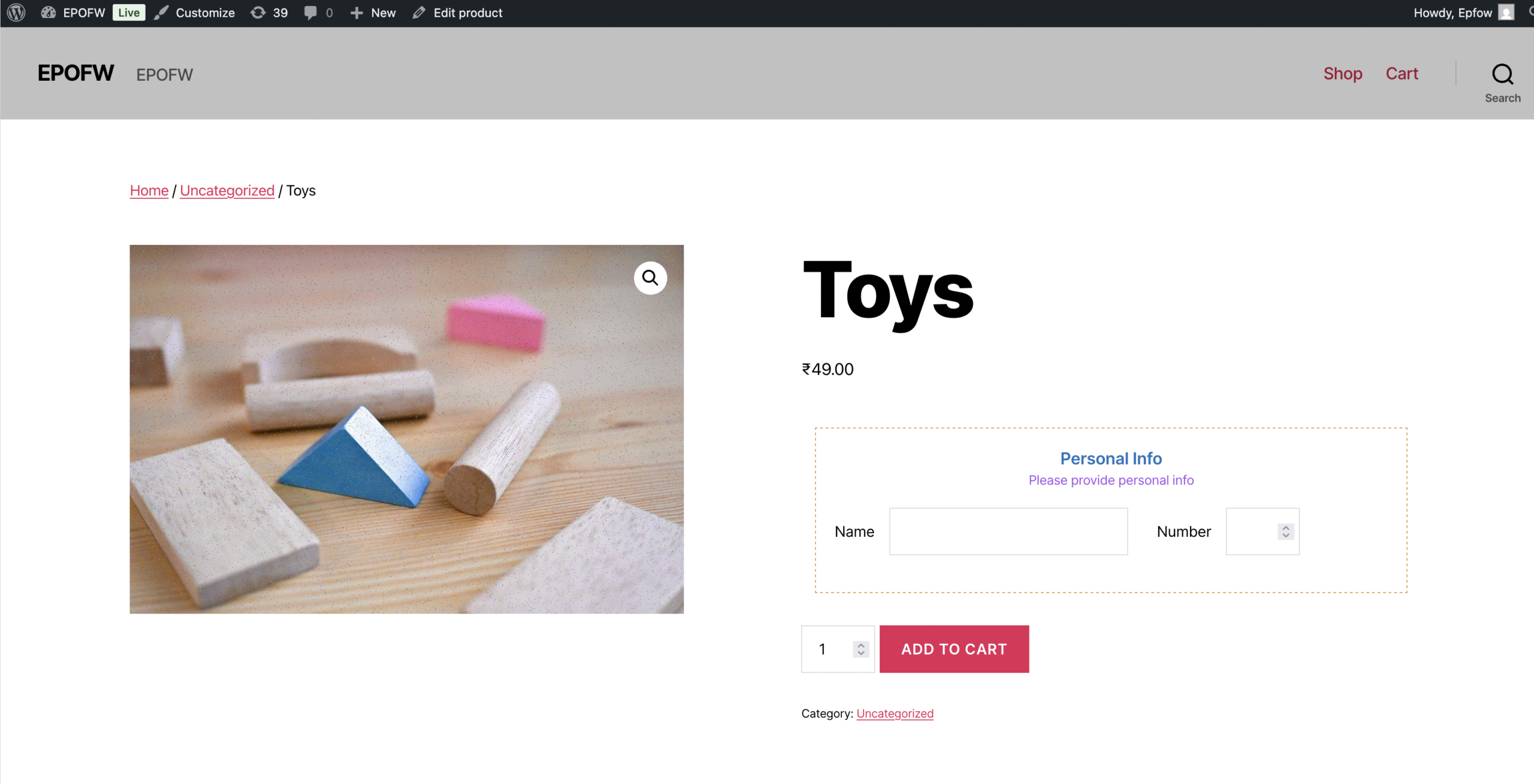
What Your Customers See
Customers interact with a clean and simple text input box that adapts based on the rules you configure. The field appearance and behavior are controlled by your settings, creating a seamless experience that guides customers through the input process.
Frontend Experience:
Field Label: Customers see the label title you configured, positioned according to your Title Position setting (Premium). The label clearly indicates what information is expected.
Input Box: A standard text input field appears, styled according to your theme and any custom CSS classes you’ve added. The field is clearly visible and easy to interact with.
Placeholder Text: If you’ve configured a placeholder, customers see hint text inside the field that disappears when they start typing. This provides guidance without cluttering the interface.
Default Value: If you’ve set a default value, customers see it pre-filled in the field. They can keep it, modify it, or delete it entirely.
Real-Time Validation: As customers type, the field validates input based on your Input Validation setting. Invalid characters may be prevented or highlighted, depending on browser behavior.
Character Limits: If you’ve set a maximum length (Premium), customers cannot exceed the character limit. Some browsers may show character count feedback.
Required Field Indicators: If the field is required, customers typically see an asterisk (*) or “required” text next to the label, indicating the field is mandatory.
Validation Messages: If customers try to submit without filling a required field, or if they enter invalid data, they’ll see validation messages. Premium users can customize these messages.
Readonly Display: If the field is set to readonly, customers can see the value but cannot edit it. The field appears normal but doesn’t accept input.
Tips for Creating Effective Text Fields
Creating an effective Text Field involves balancing flexibility with control. Consider these best practices to ensure your text fields provide excellent user experience while collecting high-quality data.
- Clear Instructions
- Use descriptive labels that immediately communicate the field’s purpose
- Add helpful placeholder text that provides format examples or guidance
- Include subtitles when additional context is needed
- Make instructions concise and easy to understand
- Appropriate Restrictions
- Choose Input Validation that matches your actual data requirements
- Don’t over-restrict – allow reasonable flexibility when possible
- Use email or URL validation only when those specific formats are needed
- Test validation rules to ensure they work as expected
- Reasonable Pricing
- Set character limits (Premium) that are appropriate for your use case
- Use default values sparingly – only when they’re truly helpful
- Configure placeholders to guide rather than confuse
- Balance required vs optional fields based on actual business needs
- User Experience
- Test fields on mobile devices to ensure proper display and usability
- Ensure labels are readable and not cut off on smaller screens
- Use consistent styling across all text fields for professional appearance
- Consider the visual hierarchy – make important fields stand out appropriately
- Data Quality
- Use validation to ensure data quality and prevent errors
- Set appropriate character limits to prevent overly long input
- Only mark fields as required when information is truly necessary
- Test all field behavior before going live
Advanced Features
- Readonly Fields: Display information without allowing edits. Useful for showing calculated values, system information, or fixed data that customers need to see but shouldn’t modify. Readonly fields appear normal but don’t accept input, and their values are included in form submissions.
- Default Values: Pre-fill fields with common text or examples. Default values provide starting points for customers and can save time when most customers enter similar information. Unlike placeholders, defaults contain actual data that customers can keep or modify.
- Custom CSS Classes: Style fields to match your theme perfectly. Add custom CSS classes to field inputs, labels, and containers for complete design control. This allows you to create branded, professional forms that integrate seamlessly with your store’s design.
- Conditional Logic: Show or hide text fields based on other selections or conditions. Use conditional logic to create dynamic forms that adapt to customer choices, showing relevant fields only when needed. This keeps forms clean and focused while providing comprehensive options.
- Integration with Other Fields: Text fields work seamlessly with other field types. Combine text fields with file uploads for complete customization, use them alongside select fields for comprehensive product options, or integrate them with conditional logic for dynamic form behavior.
Free vs Premium
Free Version Includes:
- Field Status control
- Field ID and Class customization
- Required field option
- Label Title and Subtitle
- Label Class
- Input Validation (basic options: Allow All, Text Only, Numbers Only, Numbers with Decimals, Text and Numbers, Email)
- Default Value
- Placeholder
- Readonly Field
Premium Version Adds:
- Required Text customization (text, color, class)
- Title Type, Position, and Color
- Subtitle Type and Color
- Enable Label Styling with full typography controls (font size, weight, family, alignment, transform, spacing, shadow, custom CSS)
- URL validation option
- Max Length setting
- Advanced label styling and typography options
Troubleshooting
Field not displaying
- Check Field Status is enabled (ON)
- Verify the addon is assigned to the product
- Check for JavaScript errors in browser console
- Ensure the field is within an enabled section
- Clear browser and WordPress cache
Validation not working
- Verify Input Validation setting is configured correctly
- Check browser console for JavaScript errors
- Test validation on different browsers (some browsers handle HTML5 validation differently)
- Ensure field is not disabled or hidden
- Clear browser cache and test again
Label not showing
- Check that Label Title is entered (this is required)
- Verify label styling settings if using Premium features
- Check for CSS conflicts with your theme
- Test on different screen sizes – labels might be hidden by CSS on mobile
- Inspect the page source to see if label HTML is being generated
Default value not appearing
- Verify Default Value is entered correctly in the field settings
- Check that field is enabled (Field Status is ON)
- Test on different browsers – some browsers may handle defaults differently
- Clear browser cache and test again
- Check that no JavaScript is clearing the field value on page load
Placeholder not showing
- Verify Placeholder text is entered in the settings
- Check that Default Value is not set (defaults take precedence over placeholders)
- Test on different browsers
- Ensure field is enabled and visible
- Check for CSS that might be hiding placeholder text
Readonly field still editable
- Verify Readonly Field setting is enabled (checked)
- Check for JavaScript that might be removing the readonly attribute
- Test on different browsers
- Inspect the HTML to confirm readonly attribute is present
- Clear browser cache
Frequently Asked Questions
Find answers to commonly asked questions about our products and services.
Still have a question?
If you have any other queries, feel free to reach out to us. Our knowledgeable team is here to help!
Conclusion
Text Fields offer unmatched flexibility for personalization and product customization. Their versatility makes them work well for engraving, labeling, gift messages, instructions, and more. With comprehensive settings for General Configuration, Label Customization, and Text-Specific Options, the Text Field provides everything you need to collect customer input effectively.
The combination of validation options, flexible configuration, and integration with other field types makes the Text Field suitable for nearly any business model, enhancing both product accuracy and customer satisfaction. Whether you’re collecting names, messages, or any other text-based information, understanding and properly configuring these settings will help you create professional, user-friendly forms.
With Extra Product Options for WooCommerce, creating dynamic, flexible, and professional text-based customizations becomes effortless.